INTERACTION DESIGN, PROTOTYPE, 2017
Navan – Add to Trip
In 2017, we began to redesign our mobile apps, and the team worked on many different concepts. I prototyped the City Guide as part of the trip in one of my explorations.
This concept would present users with exciting facts and things to do in their free time between events), as well as the use of interactive elements throughout the booking experience, with the end goal of increasing the number of consecutive complimentary bookings.

1 • INTERACTIVE ELEMENTS
Floating Action Button
Exploring the contextual use of the interactive FAB to help the user easily add items to complement their itinerary.
2 • MEANINGFUL ACTIONS
Create New Booking
The same button in different contexts with a distinctive meaning: the start of something new. I explored the power of the morphing Google Material FAB to help users create a new trip from the home screen or add items to an existing itinerary.
3 • PHOTOGRAPHY
The Visual Element
Using beautiful city landscapes as the trip cover photo gave the app a shiny new look and feel. It served as the primary visual anchor point to help users identify their upcoming trips faster.
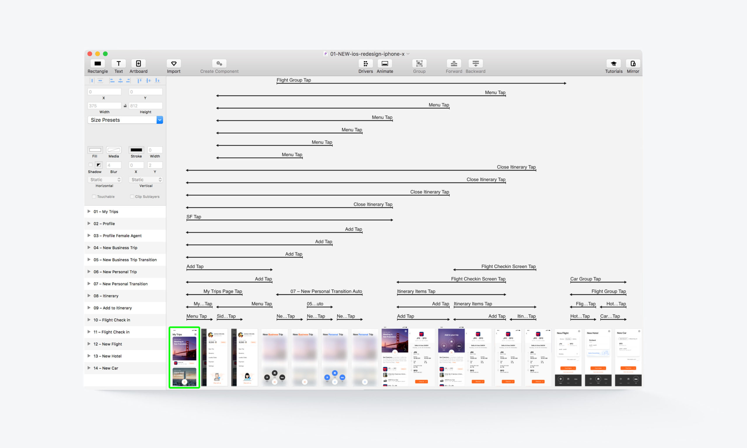
This is the complete information architecture of this prototype created with Principle. I mapped out all the interaction patterns, linked all the tap targets between screens, and created micro animations for all the use cases.
CONSIDERATIONS
These prototypes were part of extensive and collaborative teamwork. Behind the scenes, there were multiple other iterations. Over time, the app's interface and the user experience, including all micro-interactions, have been improved, modified or replaced by new patterns.
All Projects
SuitcaseDesign System
"MusicApp"Product Design
OpenStageProduct Design
Nike AdsInteraction Design
Do Not DisturbProduct Design
Micro InteractionsMicro Interaction
MondrianizmMicro Interaction
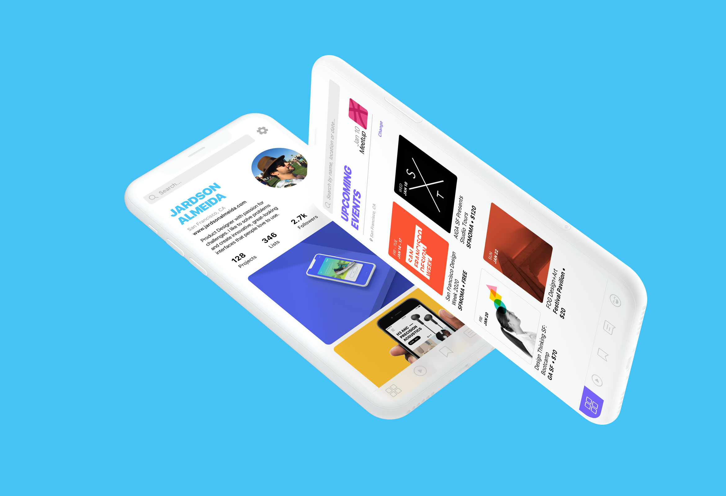
Design Social NetworkProduct Design
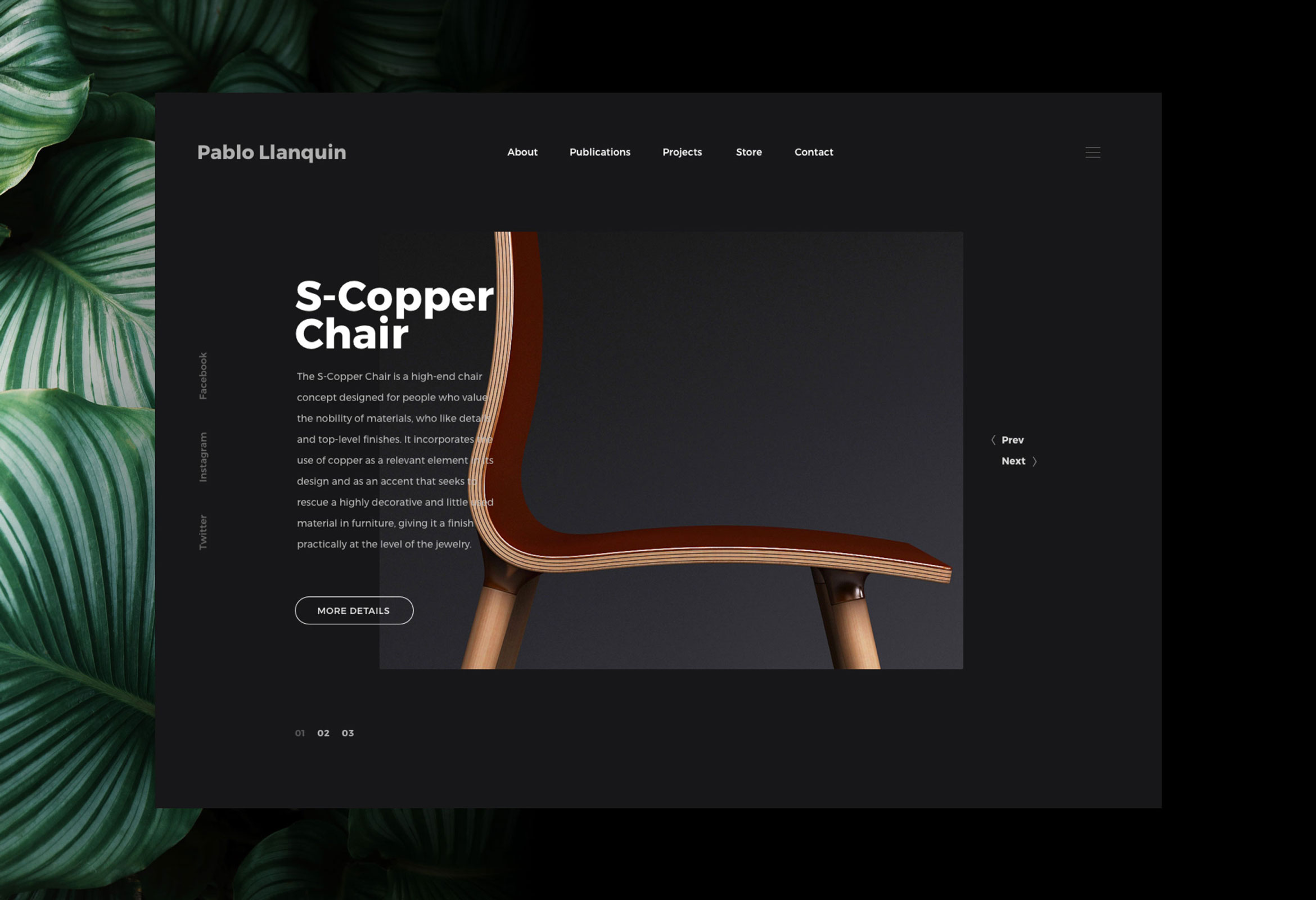
Pablo LlanquinWeb Design
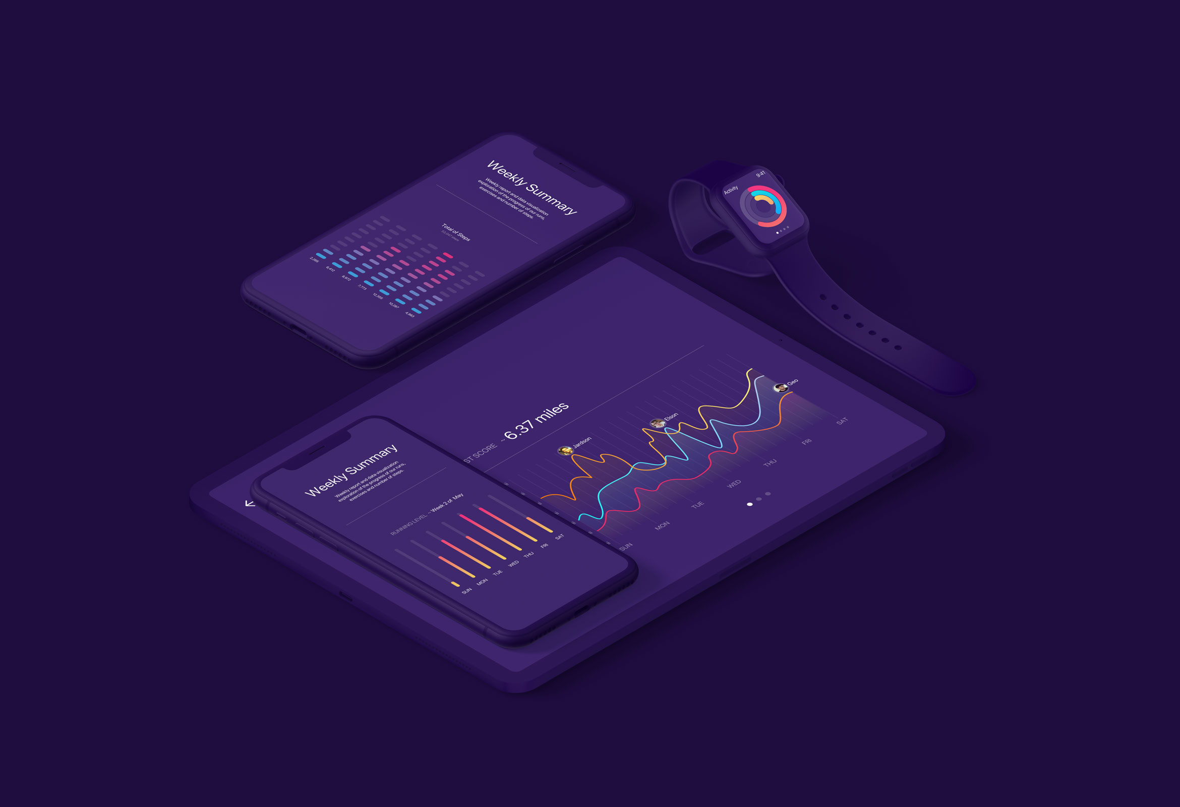
Activity MonitorData Visualization
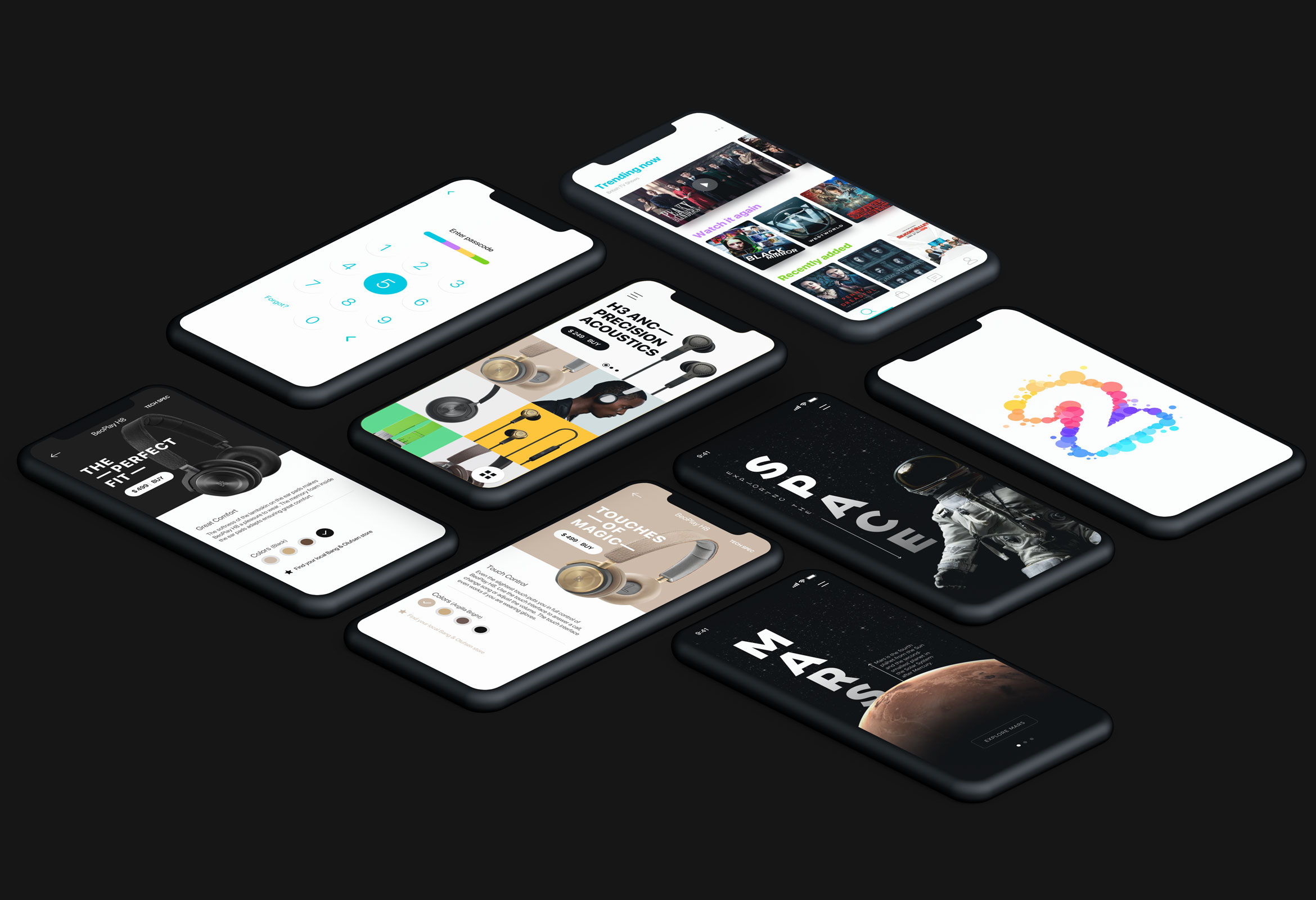
Product Interface AnimationsInteraction Design