PRODUCT DESIGN, iOS, PROTOTYPE, 2016
Design Social Network –
A personal passion project
I've always valued community, and bringing creative people together is one of my most enduring passions. I never miss an opportunity to be in meetups and conferences, as this is one of my favorite ways to stay creative and informed about everything I care about. A few years ago, in one of my conversations with my designer friends, we talked about an online community where we could share work, events, news, videos, and other forms of visual inspiration.
While this isn't an innovative idea, as there are countless design platforms, blogs, and social media apps out there where anyone can share any type of content and media, at the time, it still sounded like a fun personal project to work on. I quickly sketched, designed, and prototyped an iOS app to show how colors and beautiful visuals combined could become a fun mobile tool for designers to get inspired from.
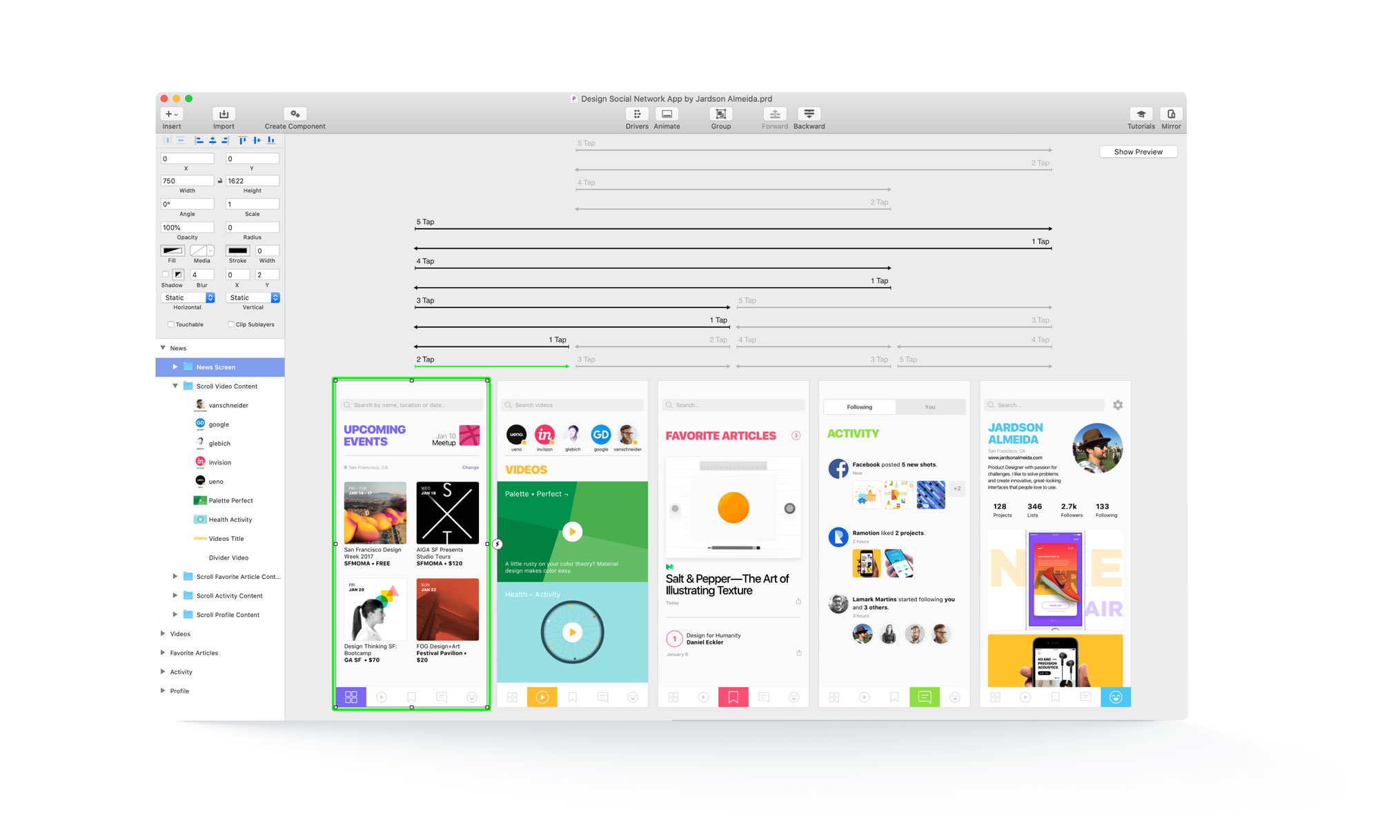
I never design anything without thinking about how other people will interact with the product. I always embrace the opportunity to delight the user experience with animations and colorful visuals. And since I was part of the target audience of this project, I felt free to pick and choose each image, icon, typography, and the visual elements used in this interface and the micro-interaction and transitions between screens.
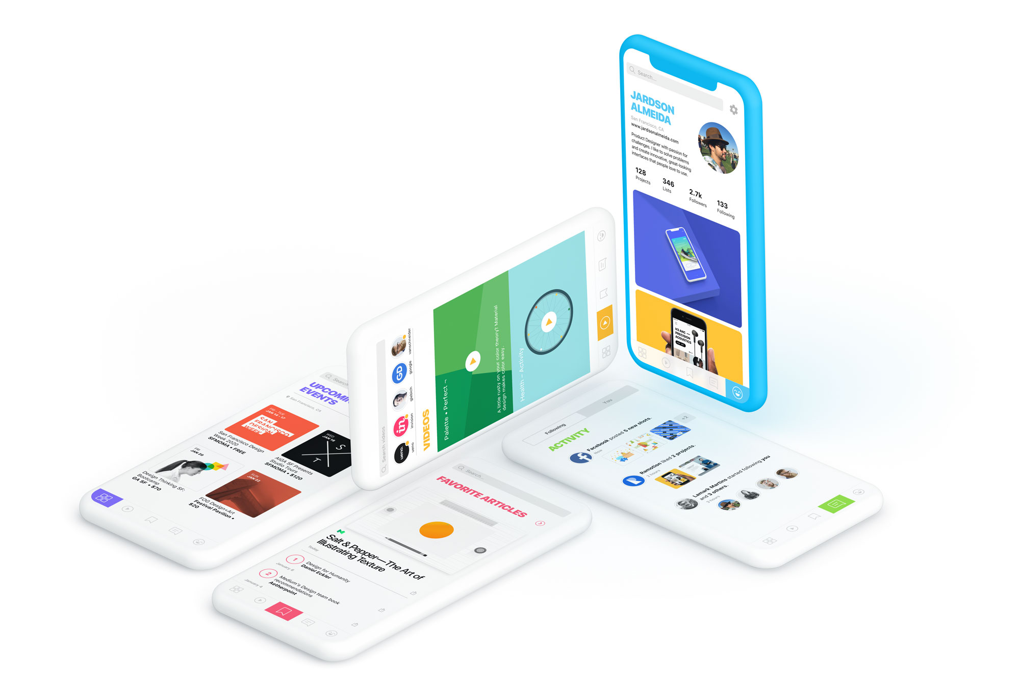
The app has five main screens dedicated to particular areas. The home page is dedicated to showing creative Events based on the user's location. The second tab is dedicated to showing Videos posted by friends or other following accounts, similar to Instagram and YouTube. The middle tab is dedicated to Articles – shared on Medium or other blog platforms – a great way to cultivate a sharp brain and stay informed. The fourth tab is where you can find all the latest updates or Activities. The last tab is the User Profile, where you can find their work.
I reserved a specific color for each page, and it's applied in the intro title and other visual elements of the content, making each section more memorable and unique. I used the page color as the selector state on the tab bar and created a rainbow effect transition when the user navigates between pages, as it's shown below. This made the experience very fun and delightful.
Get the Sketch & Principle source files for free and create your parallax animation.
All Projects
SuitcaseDesign System
"MusicApp"Product Design
OpenStageProduct Design
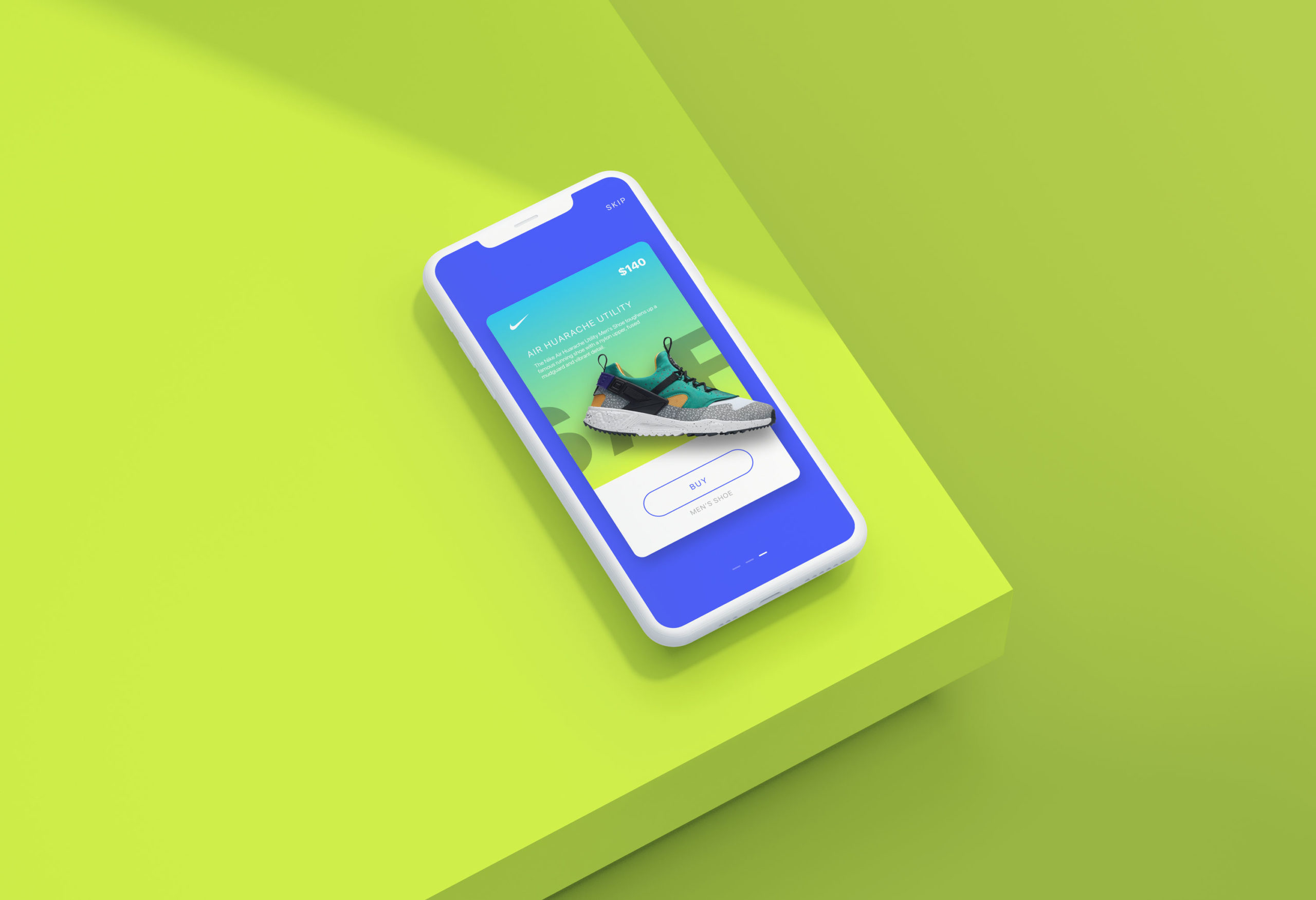
Nike AdsInteraction Design
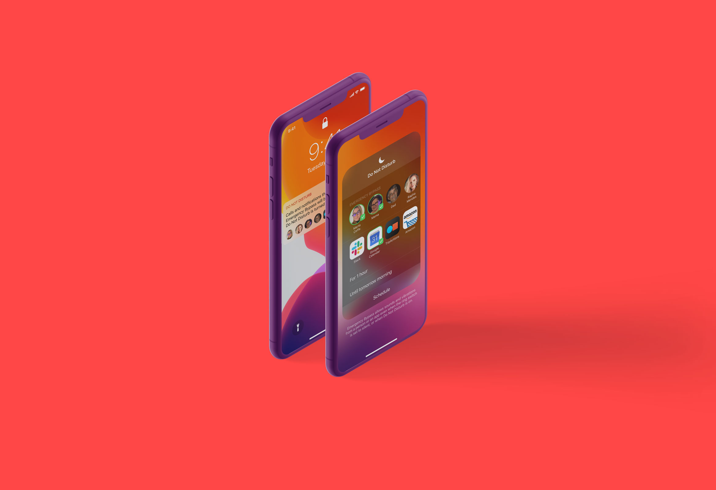
Do Not DisturbProduct Design
Micro InteractionsMicro Interaction
MondrianizmMicro Interaction
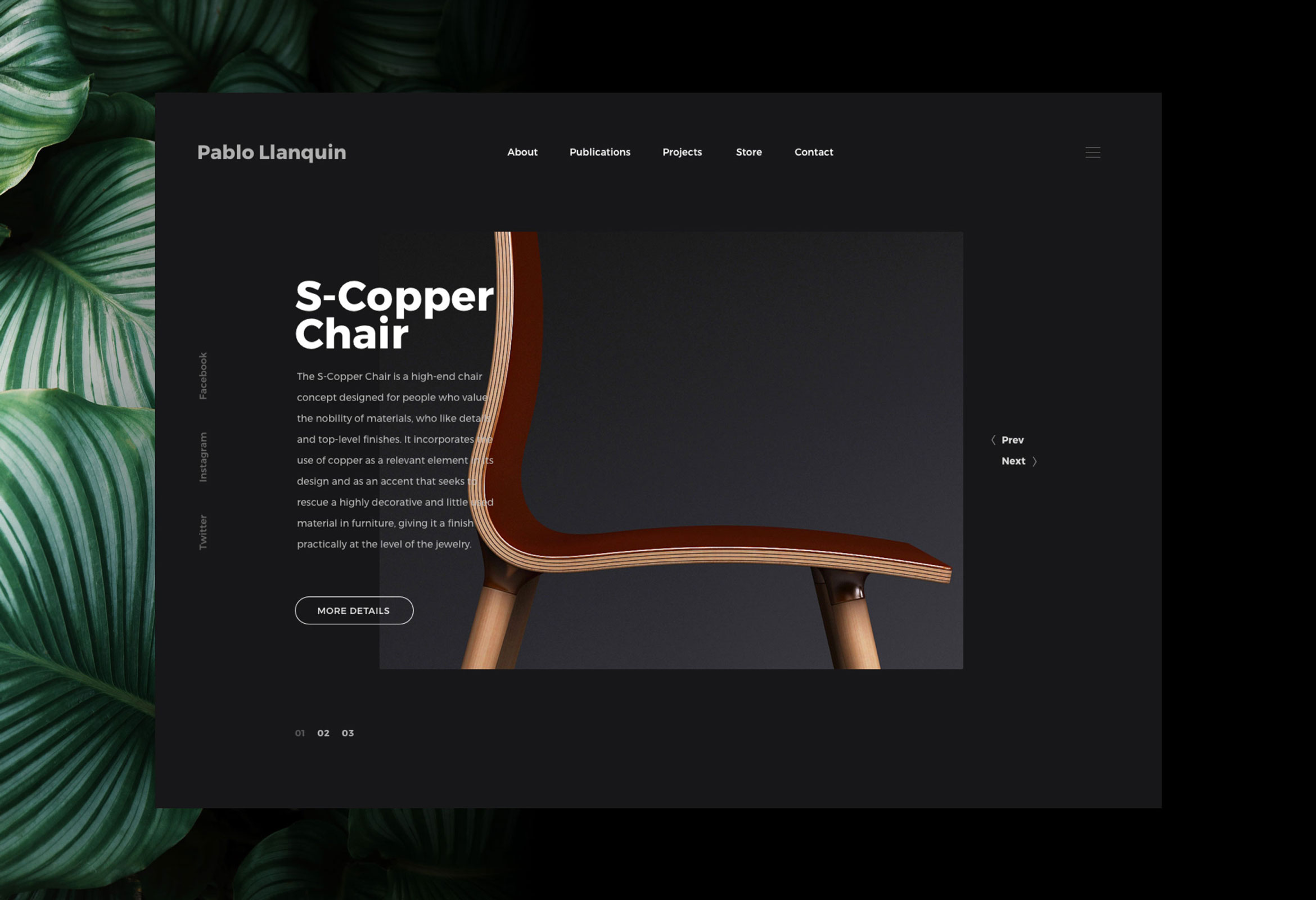
Pablo LlanquinWeb Design
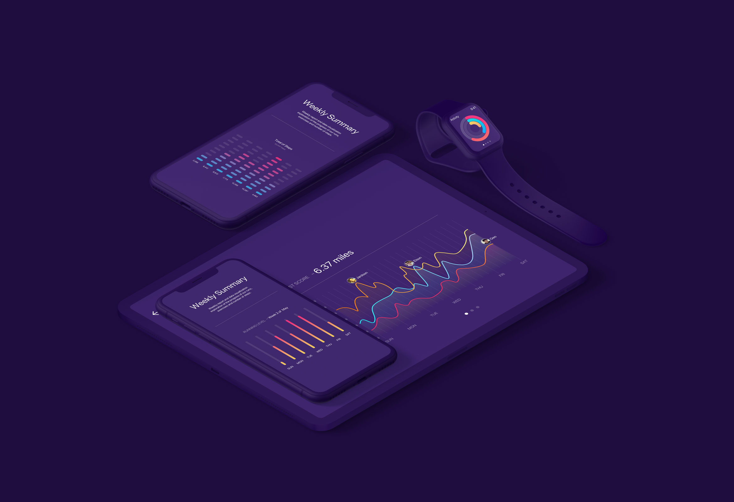
Activity MonitorData Visualization
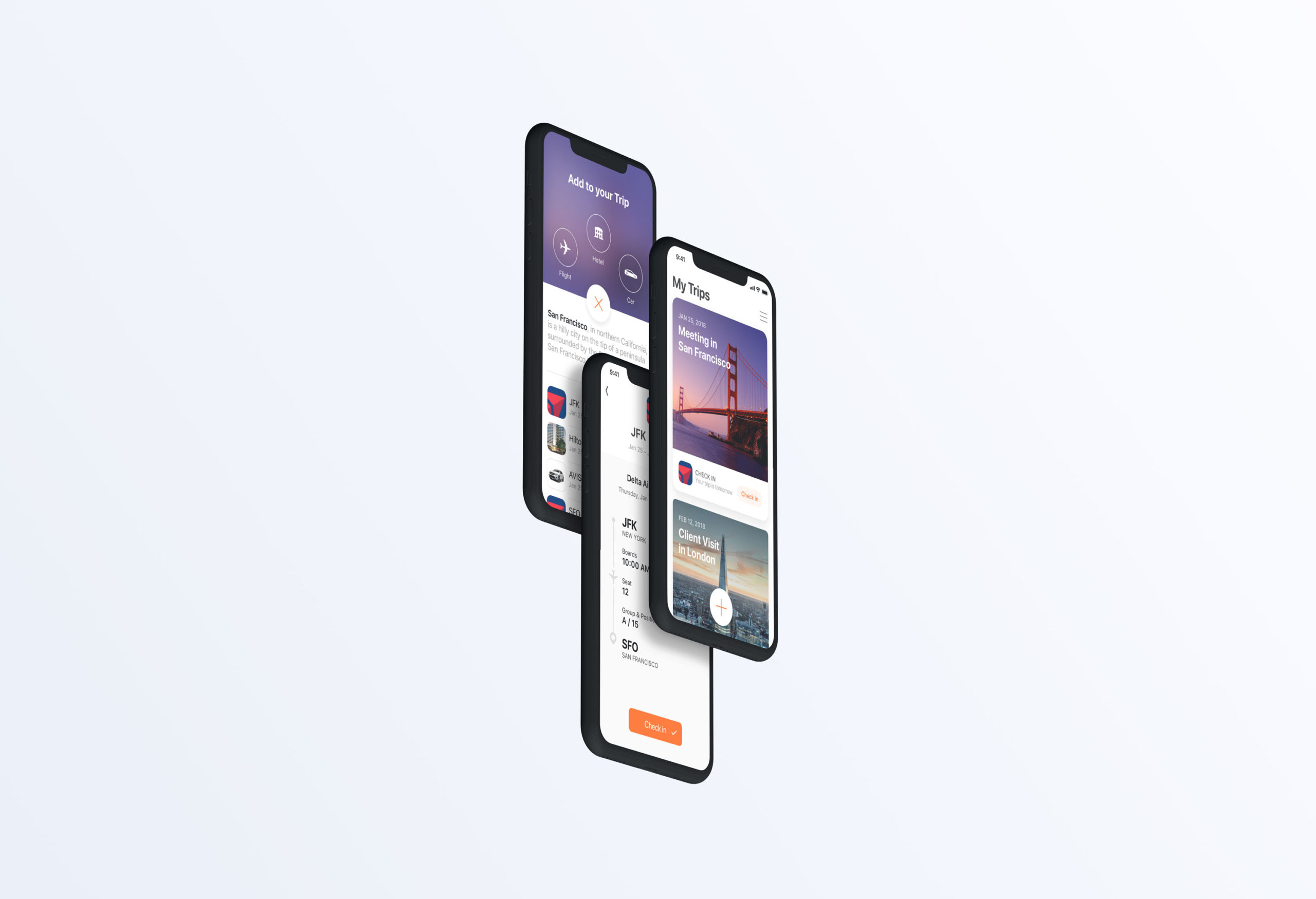
Add to TripProduct Design
Product Interface AnimationsInteraction Design
