PRODUCT DESIGN, iOS, BRANDING, 2018
OpenStage – A social video app for musicians
Over the past few years, the client has been building Pickup Music on Instagram, a growing community of music-lovers with a follower base of more than 650,000 users, when combining their most popular accounts (Pickup Music, Pickup Jazz & Pickup Beats).
It became difficult for some of their curators, fans, and music enthusiasts to escape all the noise and clutter of advertisements, comments, selfies, and unrelated posts. Music is just one of many types of content generated by its users on that platform.
We were asked to design OpenStage, a new home for the existing Pickup Music community, to connect and welcome music-lovers and everyone who appreciates talent in a more creative, free, and up-close way.

Project Details
1. Goal
The objective is to design a platform to help users easily connect, create, promote content and discover talented musicians by genre and instrument type.
2. The Challenge
How might we help build an online community for artists to showcase their talent and easily connect with like-minded music lovers and fans?
3. Deliverable
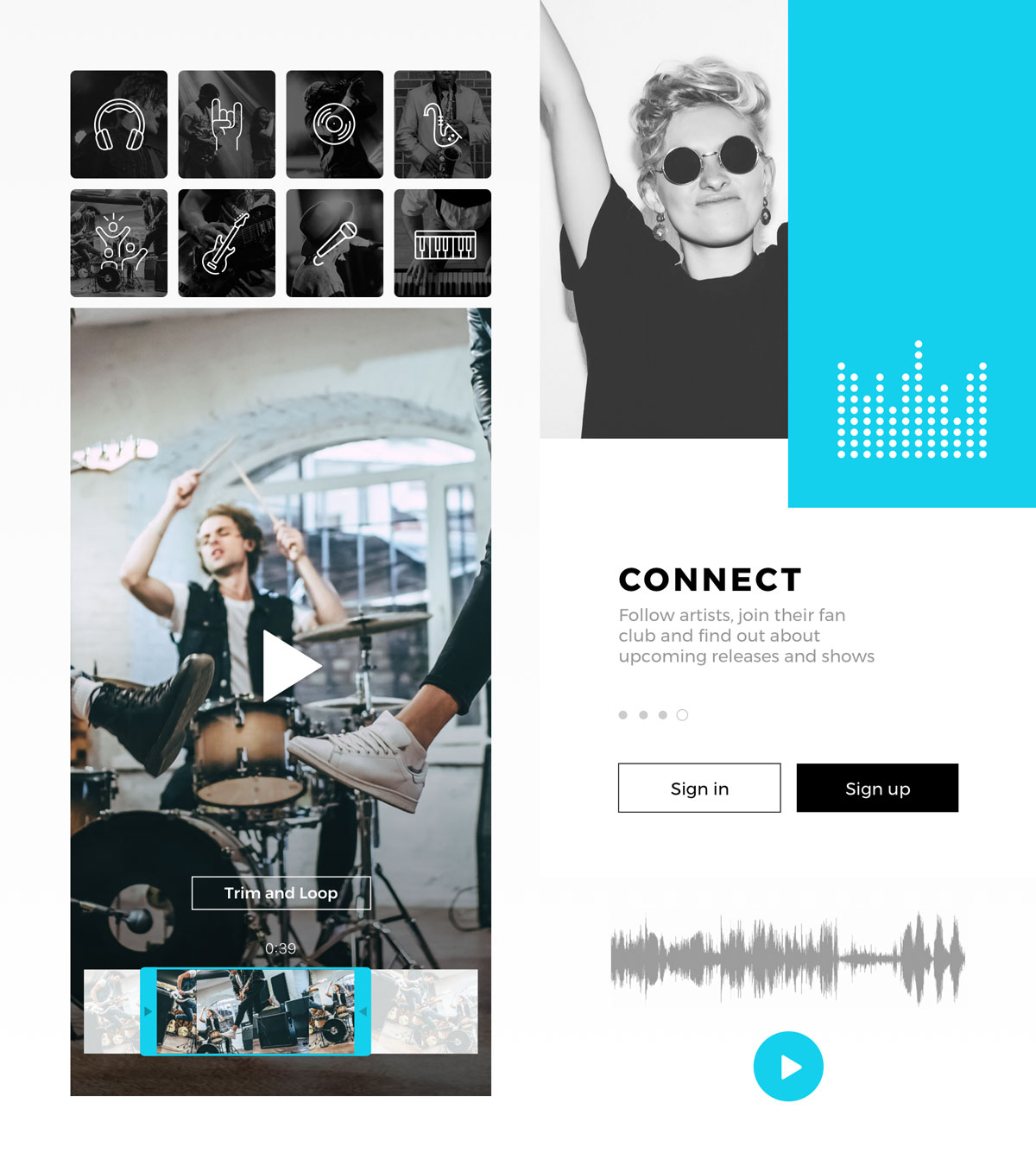
A mobile product that covers the end-to-end experience of sharing 30-second music videos. Key features: recording, editing, pre-built-in audio effects, comments, chat, and permission-based video promotion.
User Journey
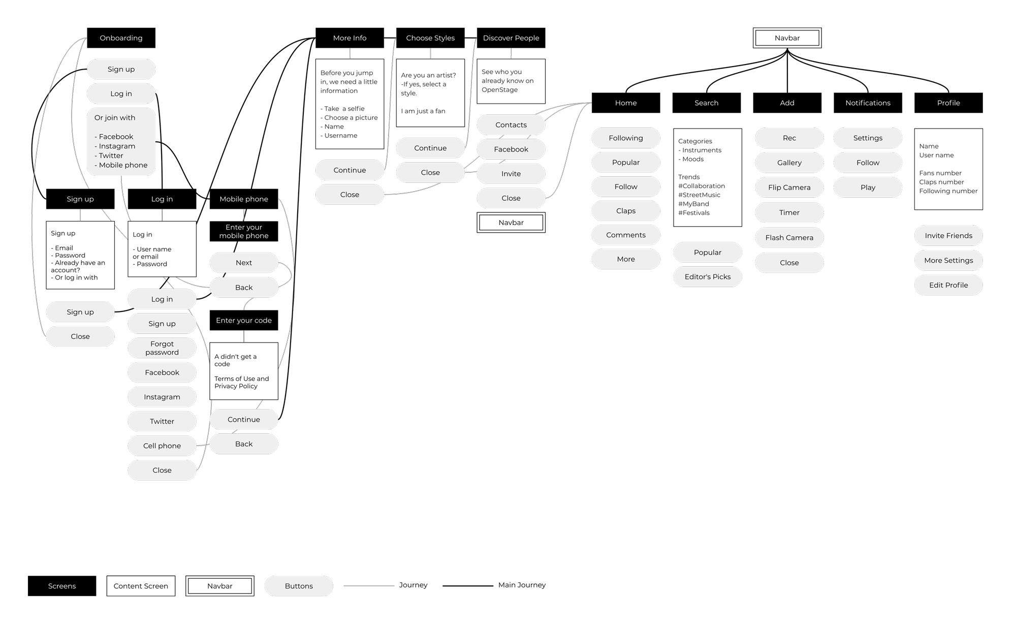
After analyzing the problem statement and learning a bit more through interviews about the behavior and needs of our primary users, we started to map out the journey through a simple flow chart to make sure we covered all of the steps to reinforce our decisions. This helps us have holistic visibility of their path from signing up to discovering new artists and creating content.
Accent Color
We designed a solution to enable the user to set the mood with a color picker.
We worked on a few different concepts with a multi-color scheme experience as part of the brand identity. This exploration allows the user to set the mood by choosing their favorite color as the accent color.
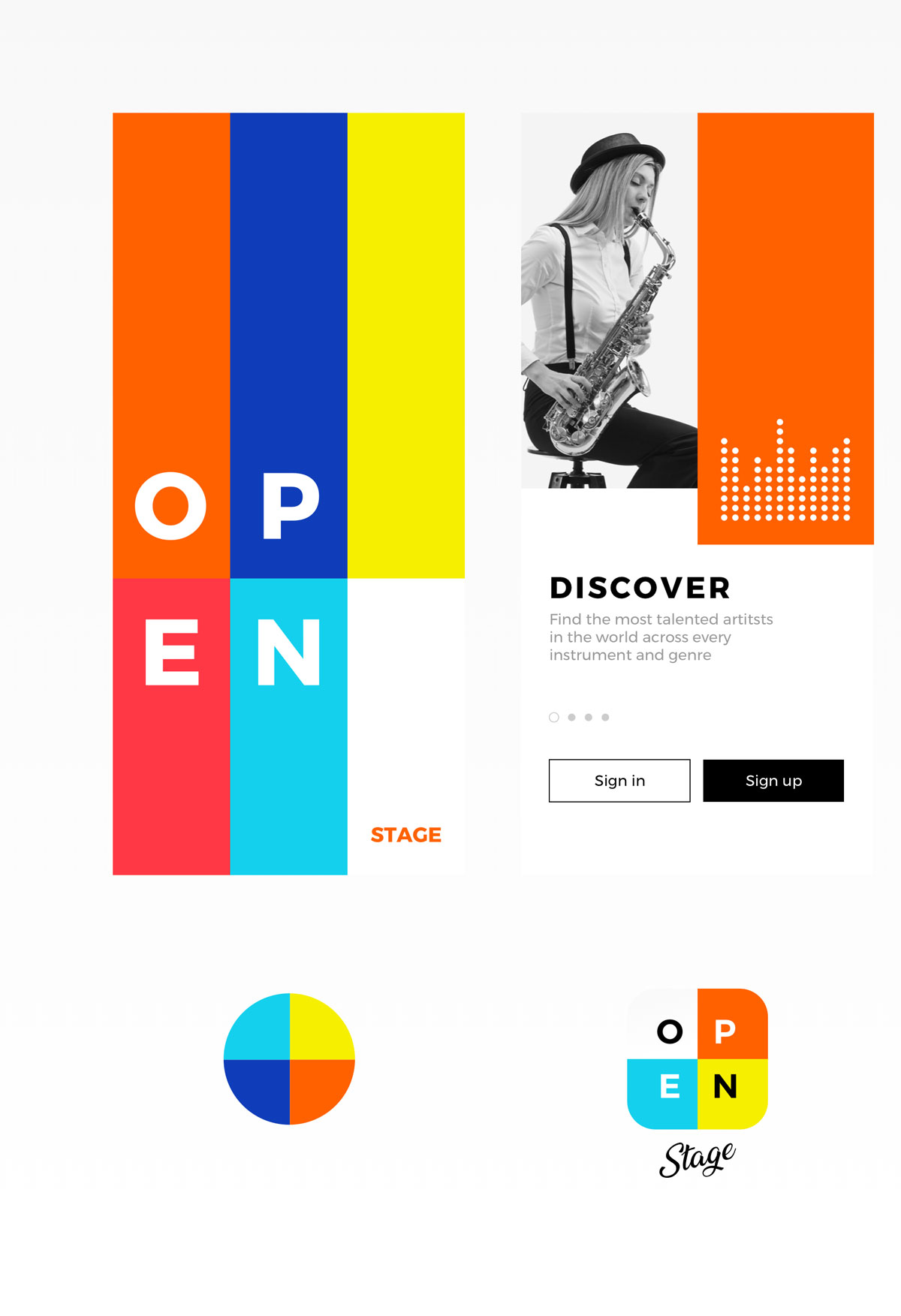
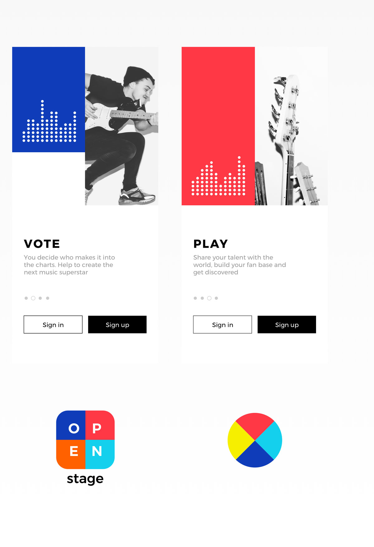
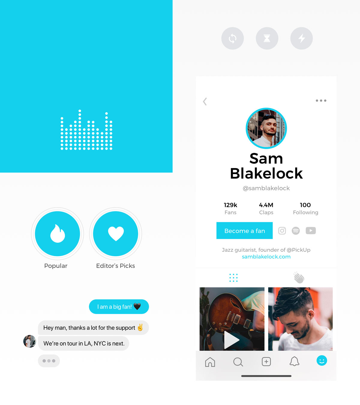
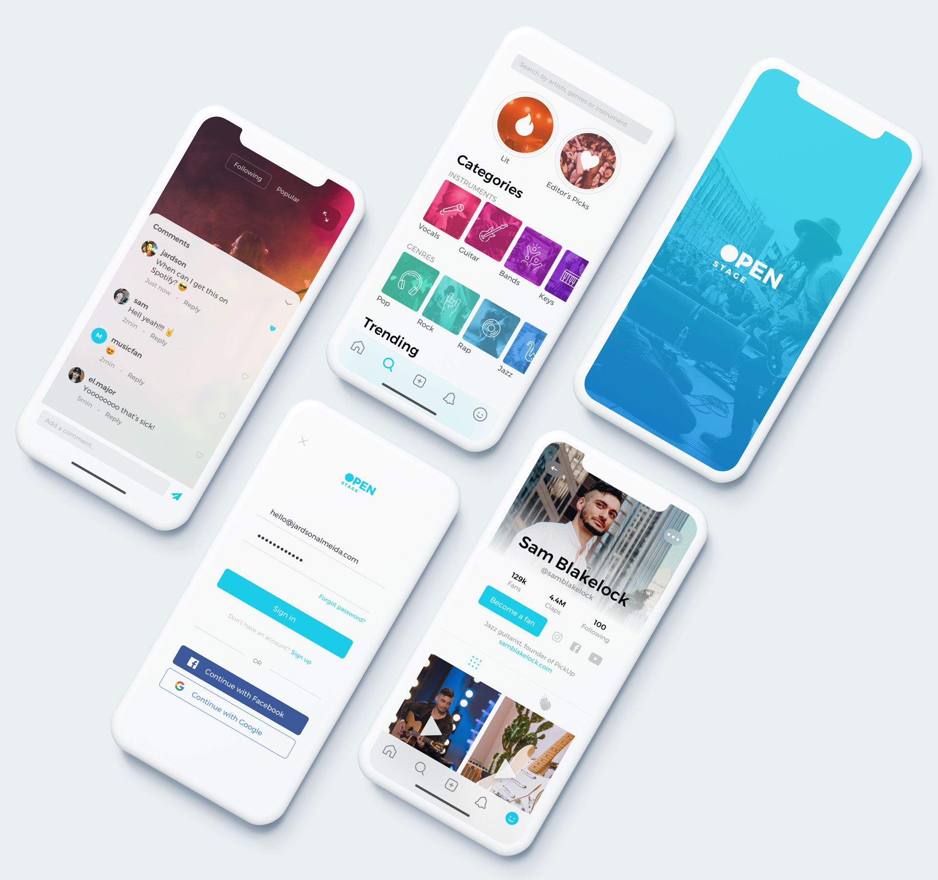
During the onboarding experience, the user is introduced to brand identity elements, such as vibrant colors, high contrast black & white photography, and an animated music equalizer graph that reinforces the connection with music.
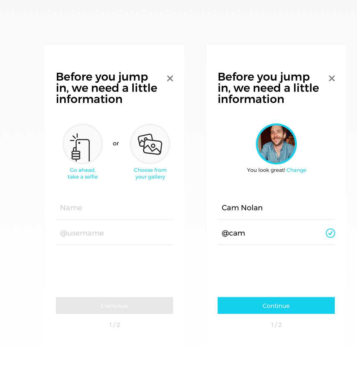
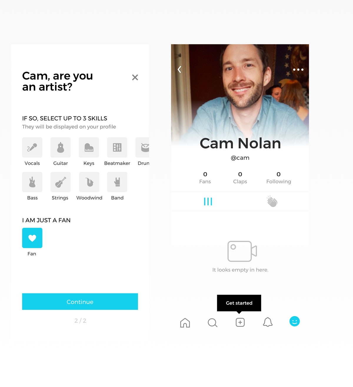
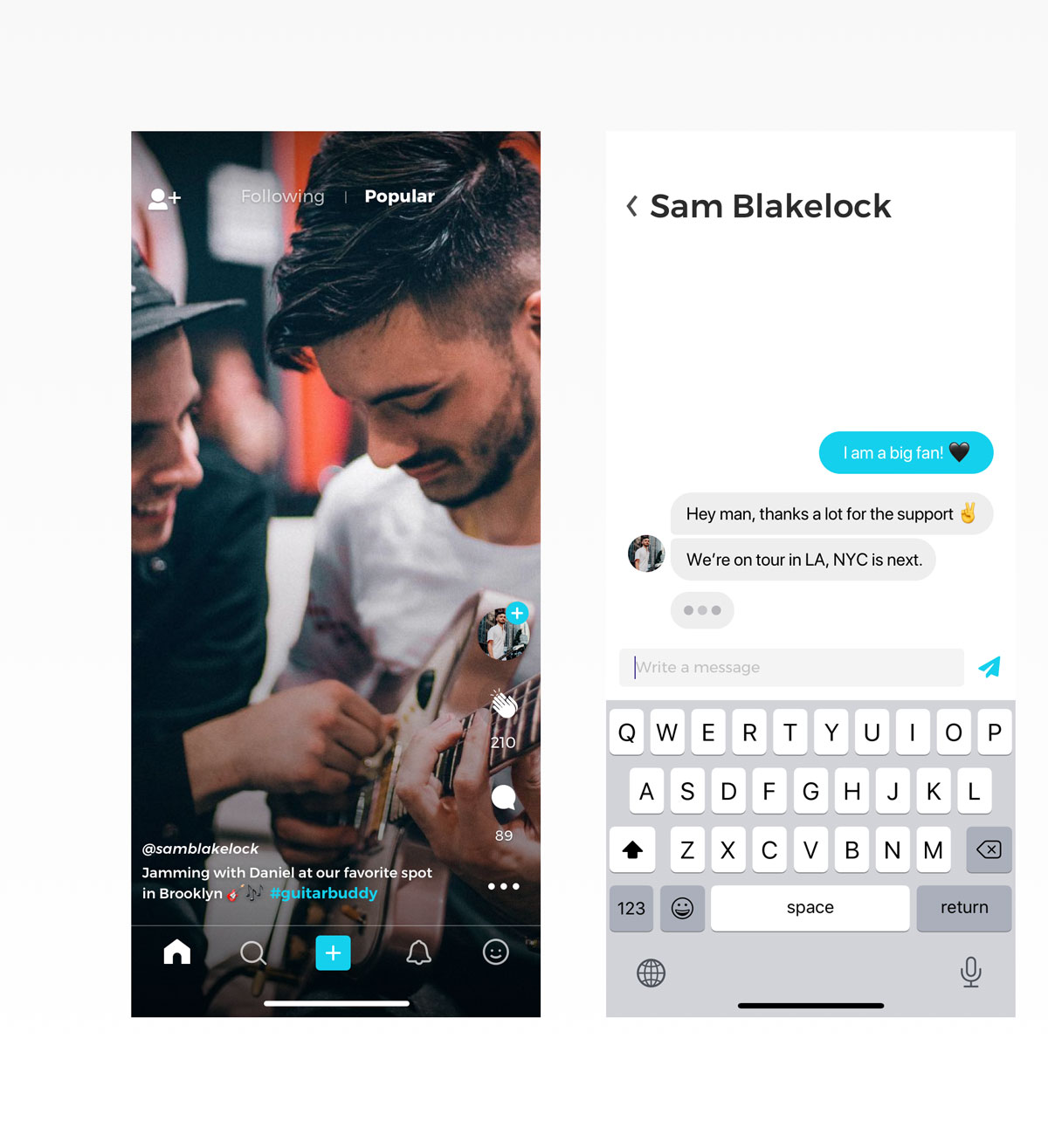
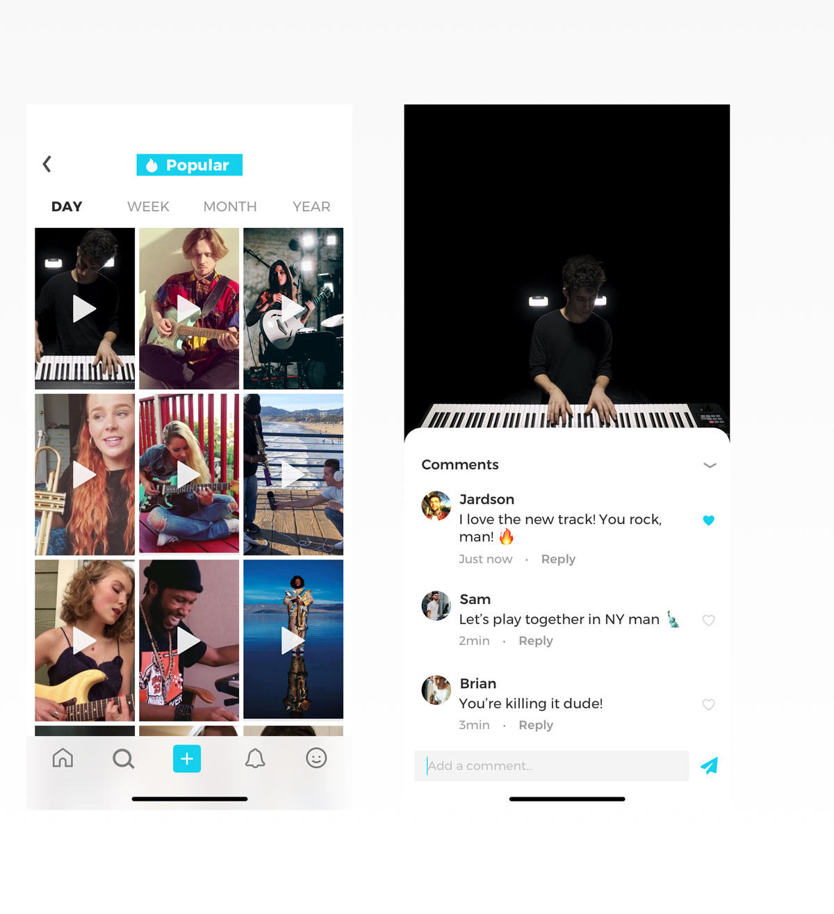
Getting started is easy. We made the signup process very straightforward. As for the Home page, the client requested us to follow the trend of the immersive full-screen video experience made extremely popular for teens by TikTok, Snapchat, and most recently by Instagram. Commenting on a video or messaging an artist or friend is one tap away. The Popular section in the Search view displays a grid of most-watched videos allowing the user to filter by day, week, month, and year.
Talent Search
We created an entire view dedicated to finding musicians by genre or instrument.
This view was designed to create a simple yet immersive experience to help users find talent based on their preferences. We chose to display large tap targets with the help of photography, iconography, and prominent colorful hashtags to make the filtering process handy.
Video Upload
We designed a full-screen camera recording experience with only a few tap targets and instructive actions to help users focus on being creative while uploading their content.
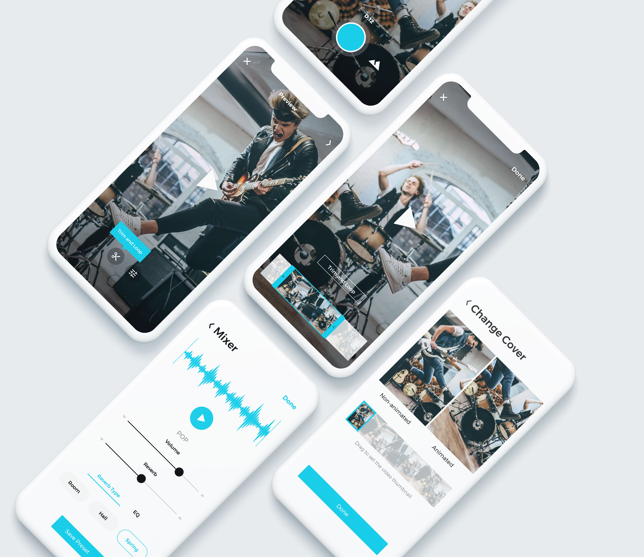
The video uploading feature is the most important experience for content creators on the platform. We dedicated special attention to this one to make it as minimal and straightforward as possible, from recording, uploading, and trimming to applying pre-built-in audio effects on videos with the Mixer feature. We aimed to create a powerful experience for the artists entirely in the app.
Dark Mode Experience
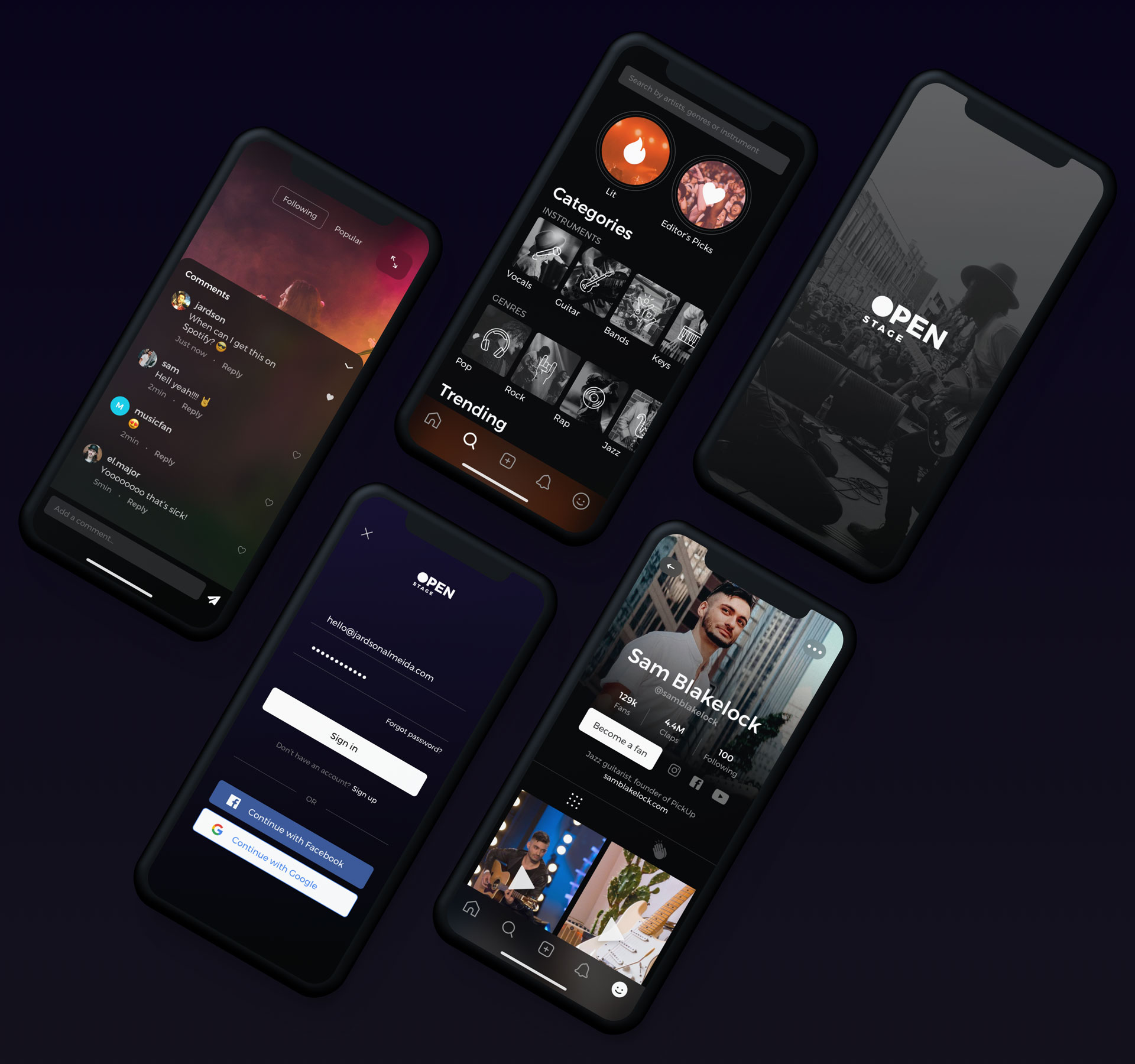
We worked on a few different user interfaces in our early explorations, including a dark theme UI. We presented the option to the client, but they decided to go only with the light theme version to cut down development costs. A year later, iOS 13 supported a dark theme by default – pushing everyone to adapt.
CONSIDERATIONS
I care deeply about music. I loved having the opportunity to work on yet another fun project such as OpenStage. My team and I created several concepts – from branding, app icons, and user interface to interaction design prototypes. We finished the project towards the end of 2018. Since then, the app has been published and modified from its original design.
Download the app. Have fun!
All Projects
SuitcaseDesign System
"MusicApp"Product Design
Nike AdsInteraction Design
Do Not DisturbProduct Design
Micro InteractionsMicro Interaction
MondrianizmMicro Interaction
Design Social NetworkProduct Design
Pablo LlanquinWeb Design
Activity MonitorData Visualization
Add to TripProduct Design
Product Interface AnimationsInteraction Design
