DESIGN SYSTEM, WEB, iOS, ANDROID, 2019
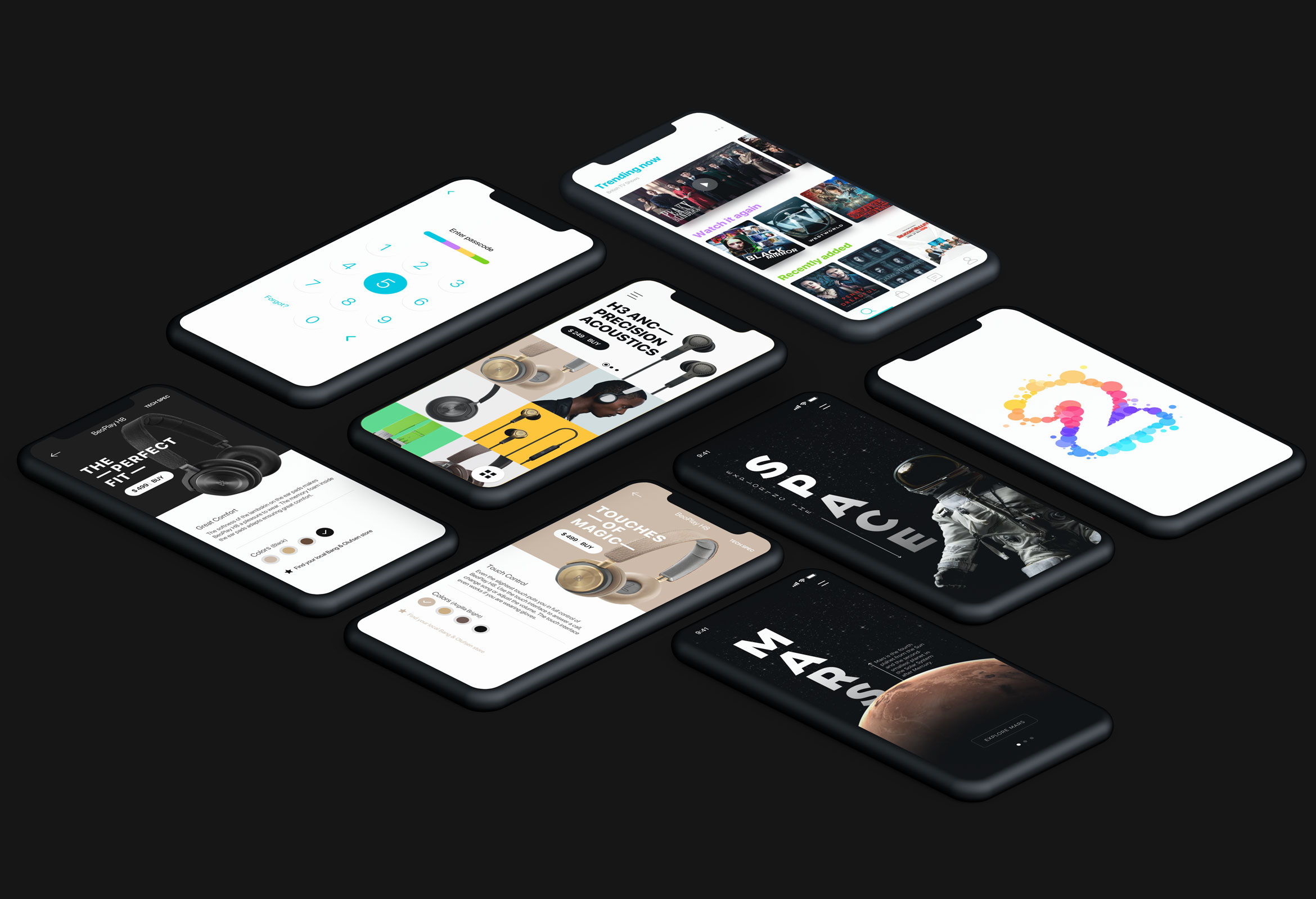
Suitcase – Navan's Design System
As the Navan design team grew, it became increasingly important to maintain a consistent style, visual language, and user experience across all platforms. With multiple different products for travelers, financial teams, admins, and support agents, it was clear that we needed a more systematic way to guide and leverage our collective and creative efforts.
Our initial goal was to have a collection of reusable components and visual elements guided by clear principles to create a more cohesive ecosystem.
My role in the system
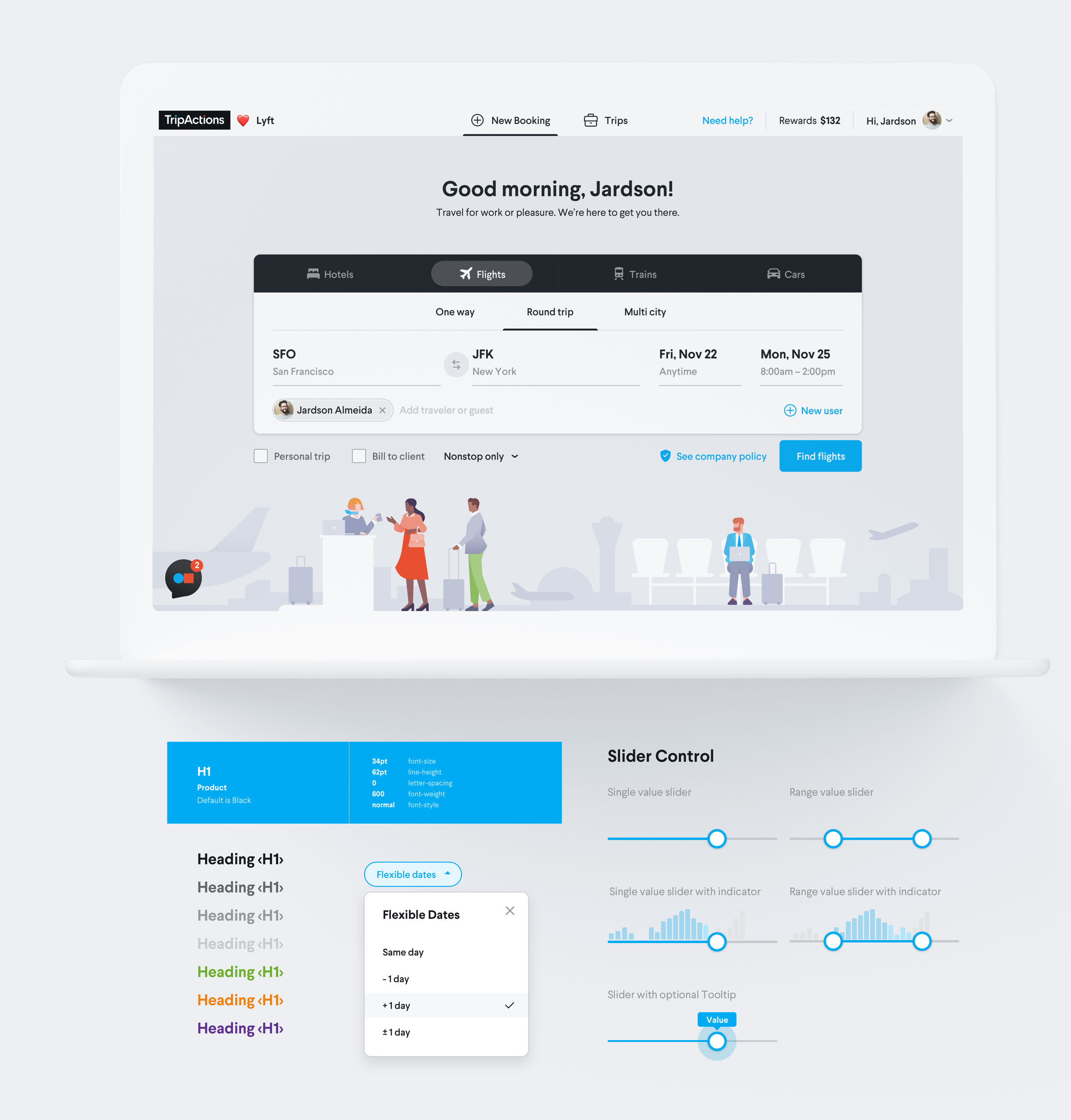
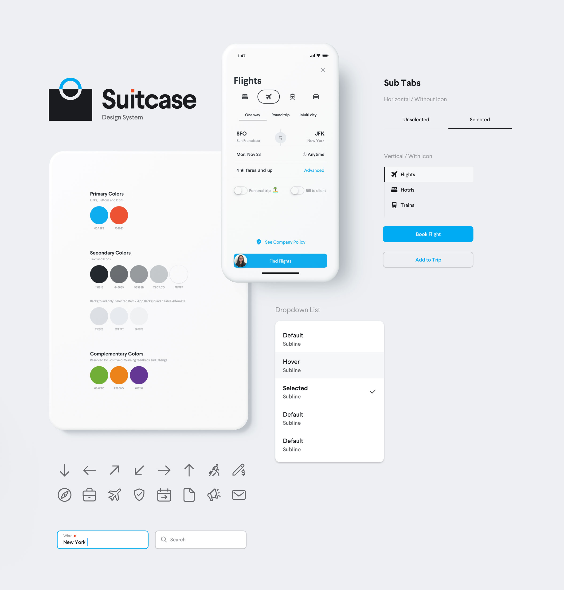
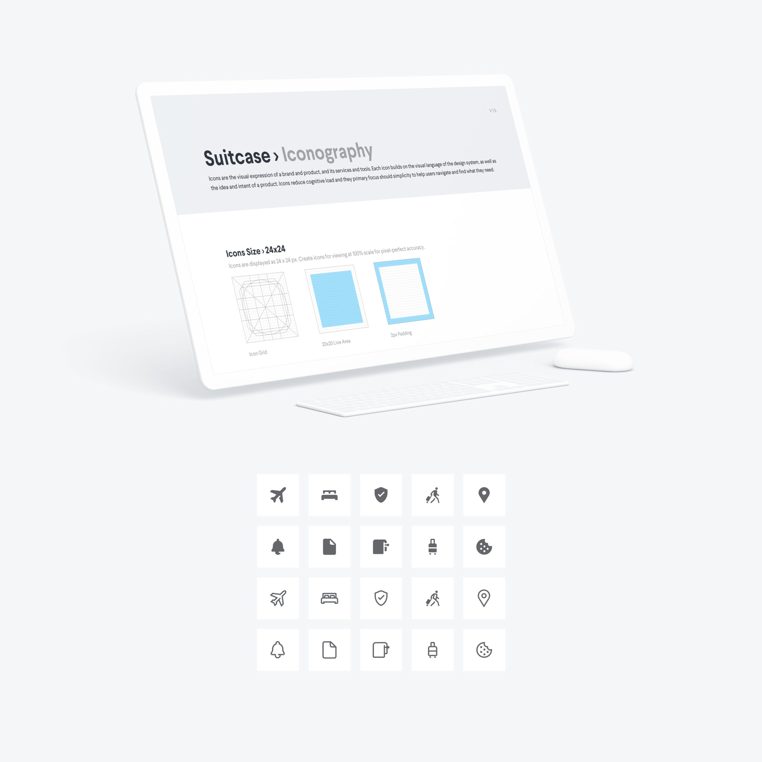
I co-led a foundation initiative, establishing brand and product guidelines for Suitcase 1.0, our first official design systems project. This version included documentation for symbols, colors, components, iconography, illustrations, typography, grids, personas, white-label templates, and more – across the web, iOS, and Android platforms.
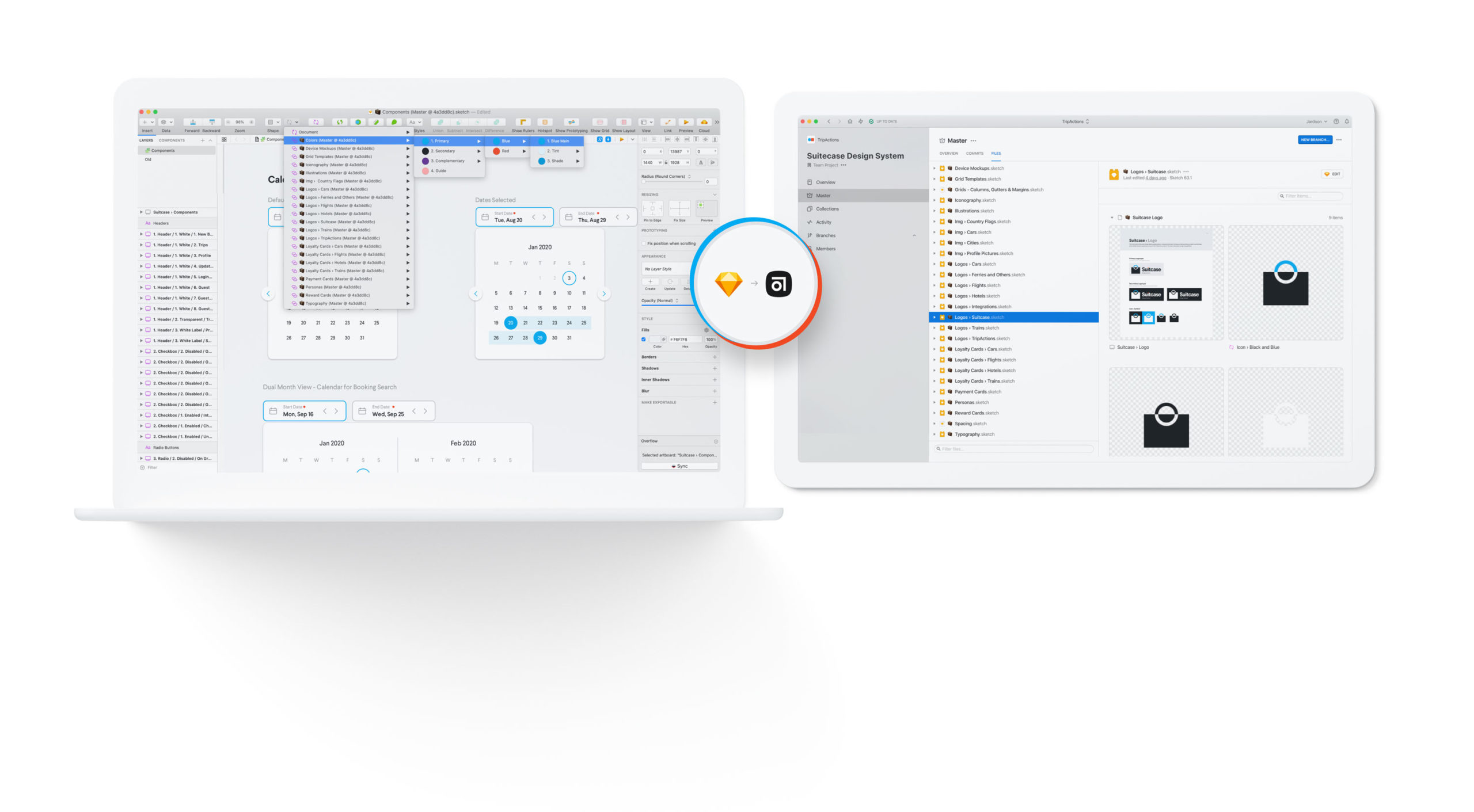
Sketch + Abstract
For over four years, Sketch was our primary tool for visual design. We used Abstract for work collaboration, version control, library management, and design system hosting. We handed off designs via Zeplin.
Team Work
This documentation results from the incredible effort and expertise of a talented team. Everyone made an enormous contribution to this project by dedicating time, brainpower, and creative energy.
I collaborated with Diego Costa in documenting the guidelines to define the style of hundreds of unique icons that gave birth to our iconography library. Diego's contribution was essential to making this project possible.
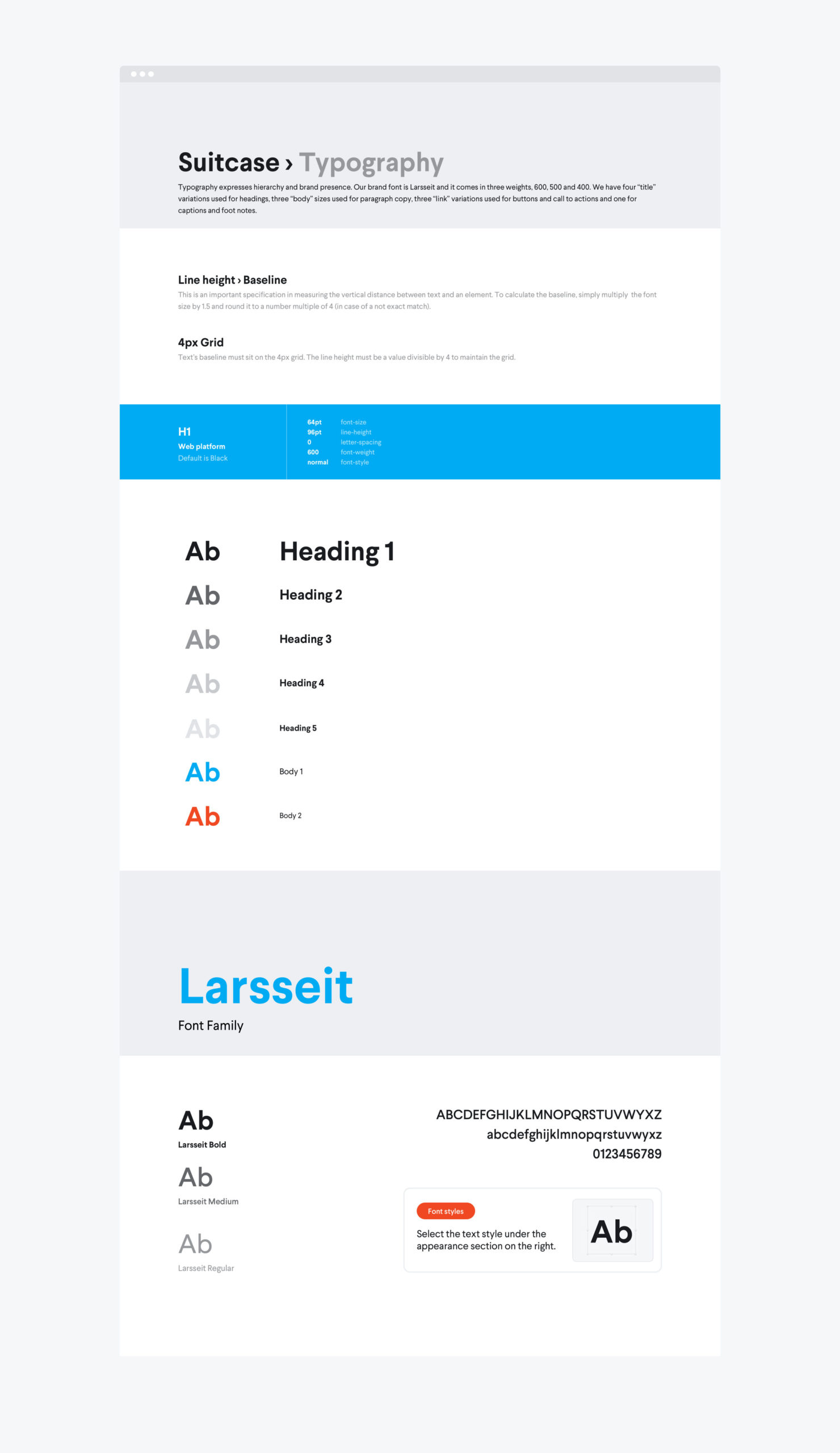
Larsseit is the font family used in the Navan brand identity. In our products, we use three different weights for titles, subtitles, and body copy: Bold (600), Medium (400), and Regular (300), respectively. We default black for text over light backgrounds. Blue for links and CTA buttons. Green for success messages. And orange to communicate warning or error states.
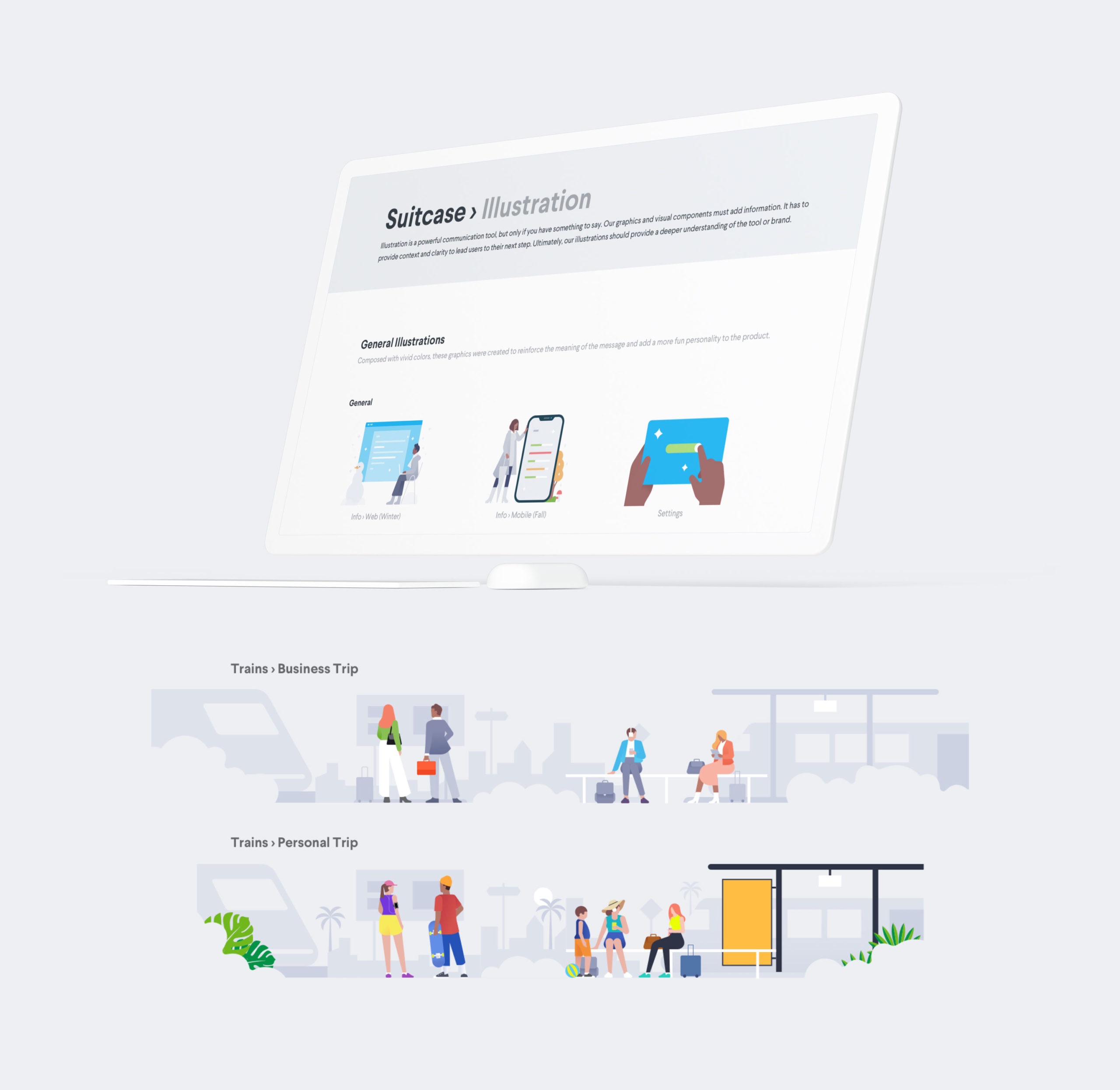
I also collaborated with Justina Leisyte and Diego Costa to define the guidelines for colors, shapes, and scenes composition to create our illustrations and visual elements.
Learnings
Suitcase influenced multiple projects after its launch. It became the source of truth for design guidance to drive consistent user experience with a renewed overall look and feel.
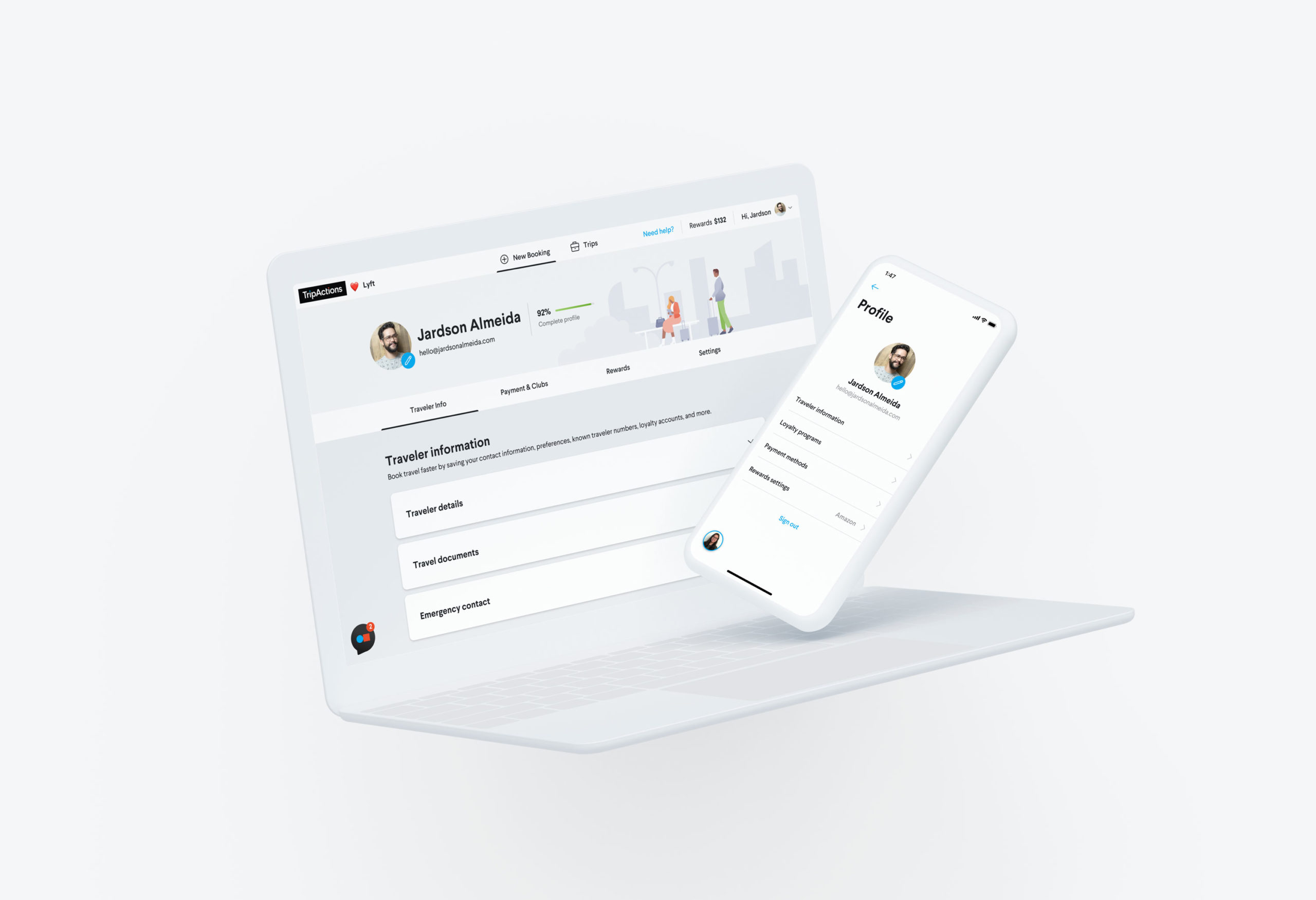
The above is one of the redesign proposals for the home page and user profile. Ever since we launched Suitcase, our product has been moving in this visual direction, and it's becoming more and more part of our user experience and brand identity.
Next Steps
A design system is always an ongoing project that will keep evolving. We kicked this project off to solve various creative and technical problems and make our workflow more efficient to drive consistency across our products and brand identity. The team has many plans to keep developing Suitcase to help improve the product and user experience, such as accessibility, energy efficiency with a dark theme, and making it accessible in multiple languages to support all of the customers throughout the globe.
Dream Team
Kudos to the amazing design team that led the initiative of the first version of Suitcase. Teamwork makes the dream work. You guys rock!

Kevin Lanceplaine
Diego Costa
Ali Ozturk
Marta Ceffa

Rus Khaydarov

David Lecoutre

Jardson Almeida
CONSIDERATIONS
After extensive use of the current version, the team made several adaptations throughout multiple projects. As the team migrated to Figma, the system kept evolving. Suitcase 2.0 came to life: a newer, more flexible, and collaborative version, guided by our design principles to drive work efficiency, communication, and clarity.
All Projects
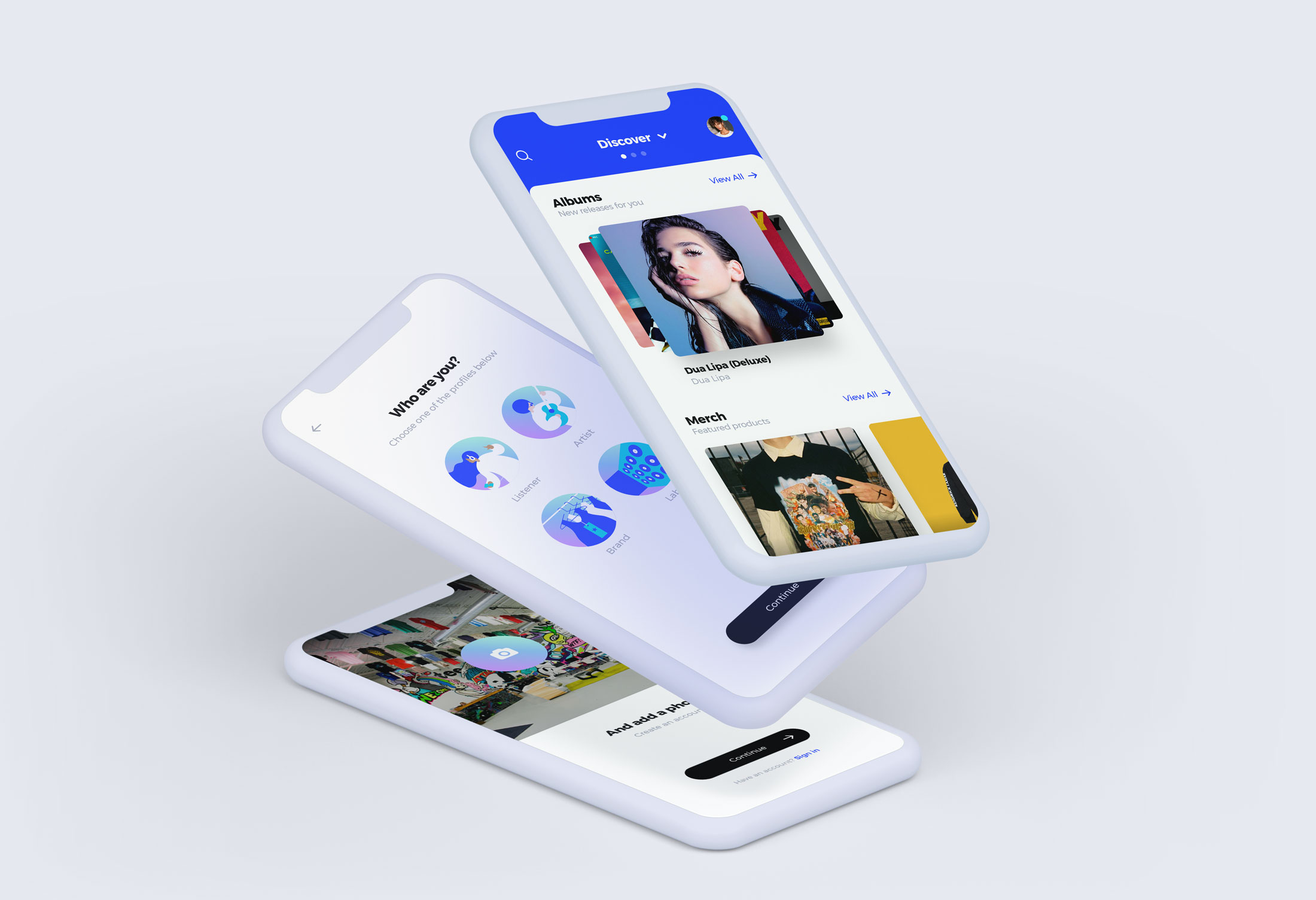
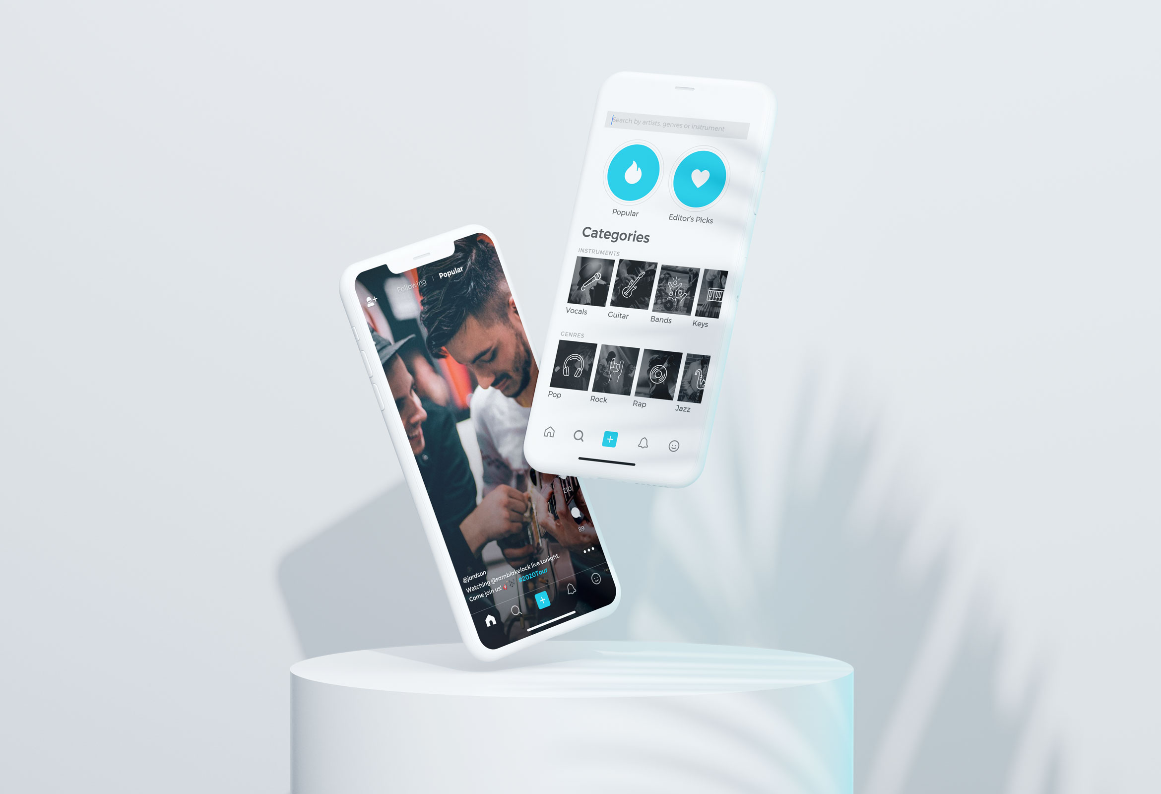
"MusicApp"Product Design
OpenStageProduct Design
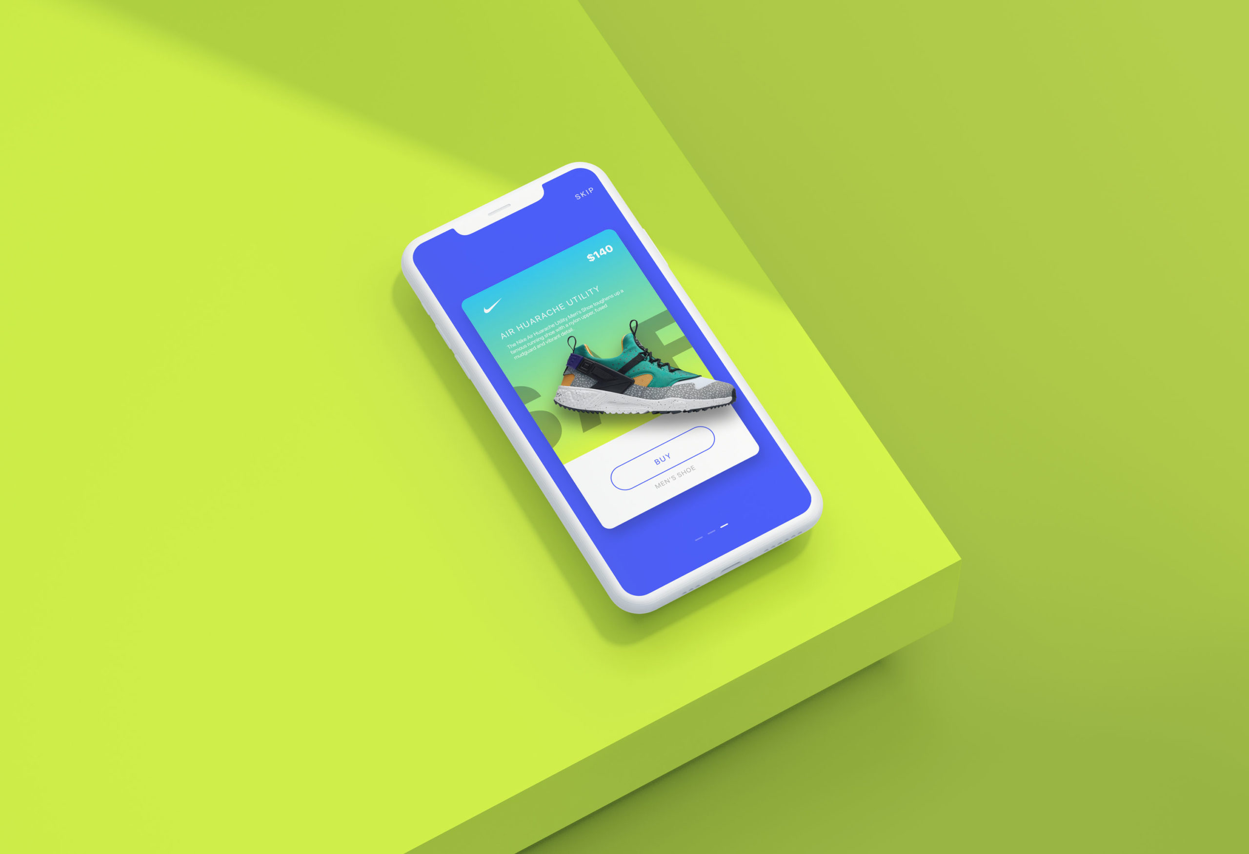
Nike AdsInteraction Design
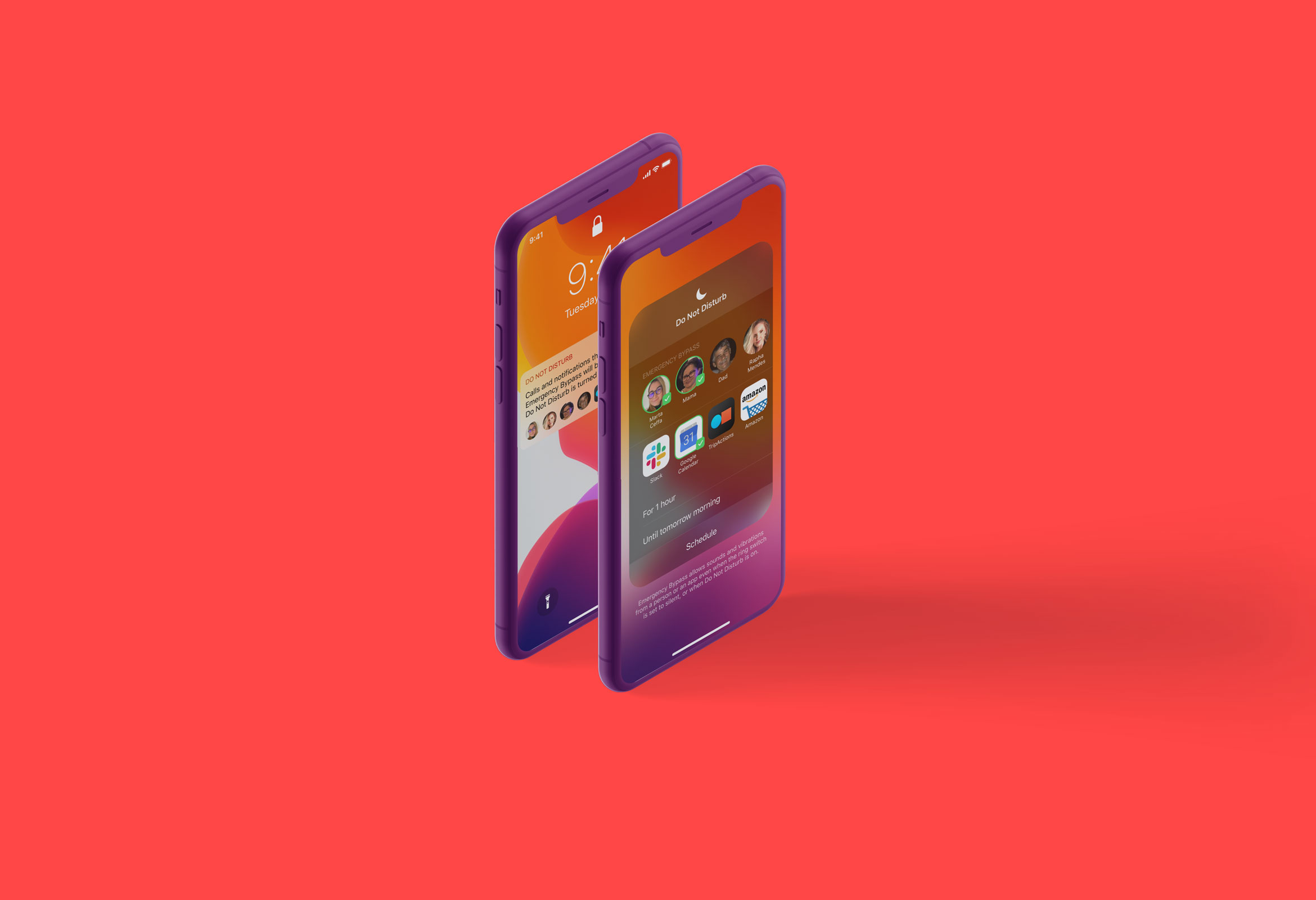
Do Not DisturbProduct Design
Micro InteractionsMicro Interaction
MondrianizmMicro Interaction
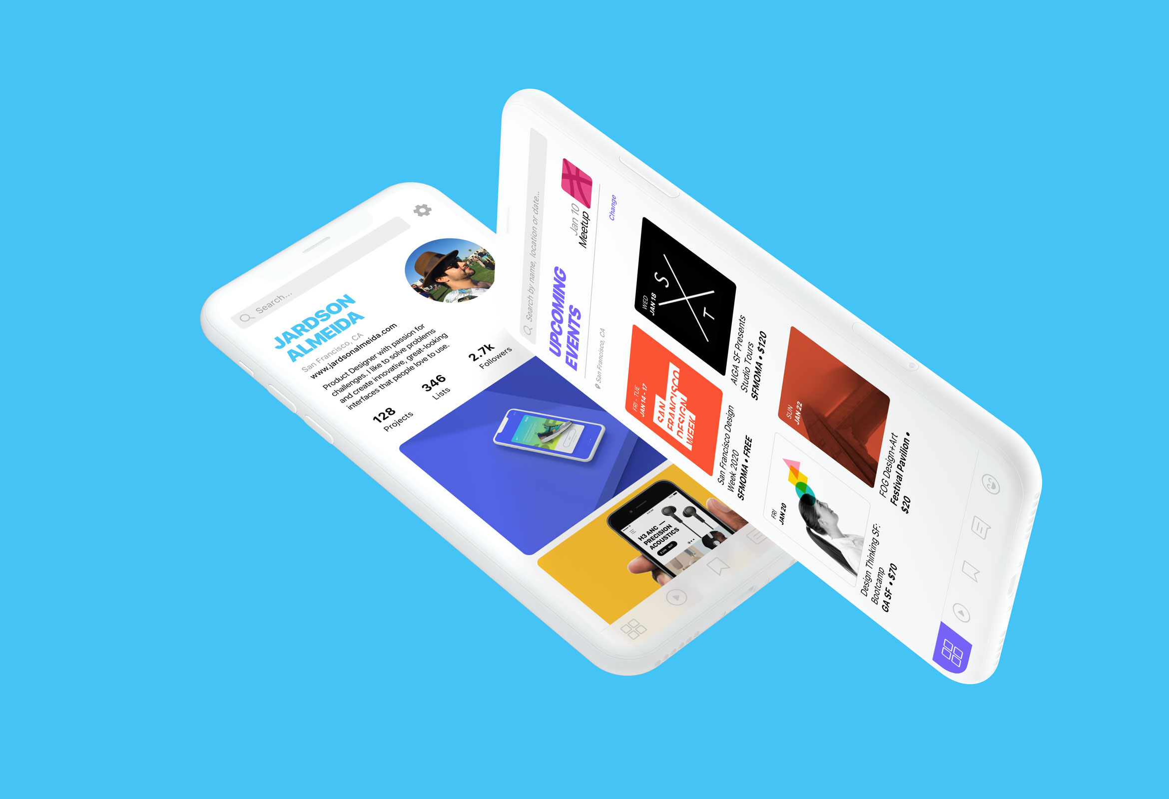
Design Social NetworkProduct Design
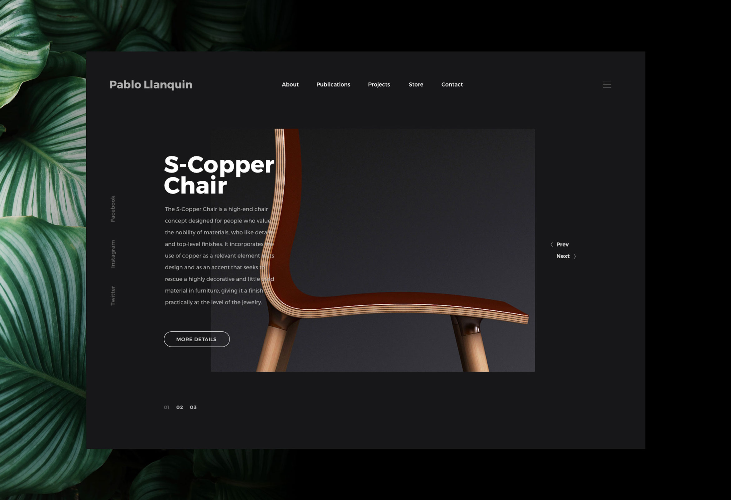
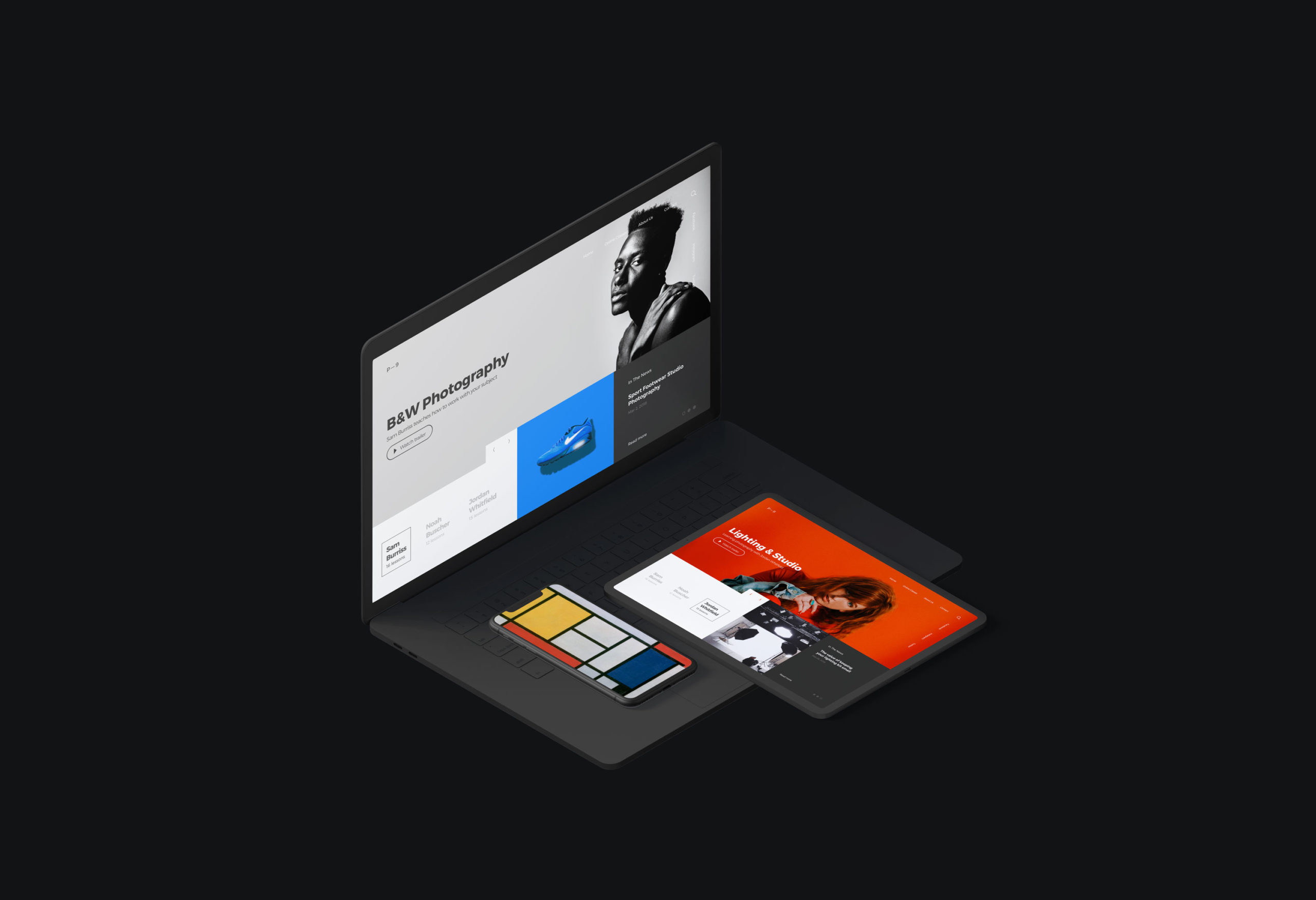
Pablo LlanquinWeb Design
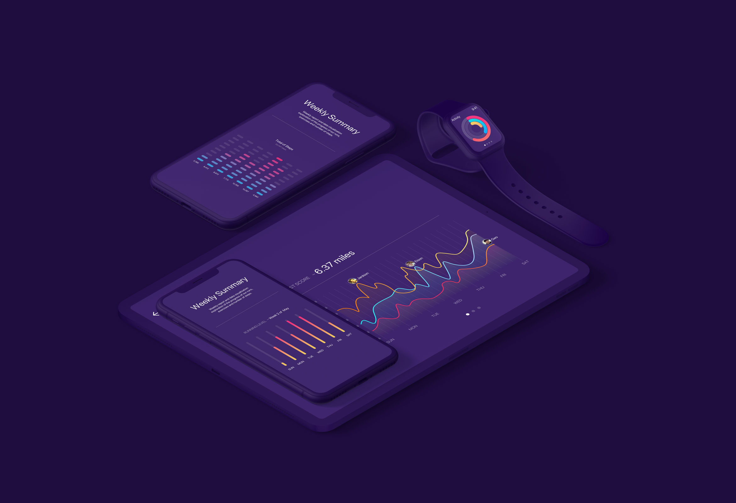
Activity MonitorData Visualization
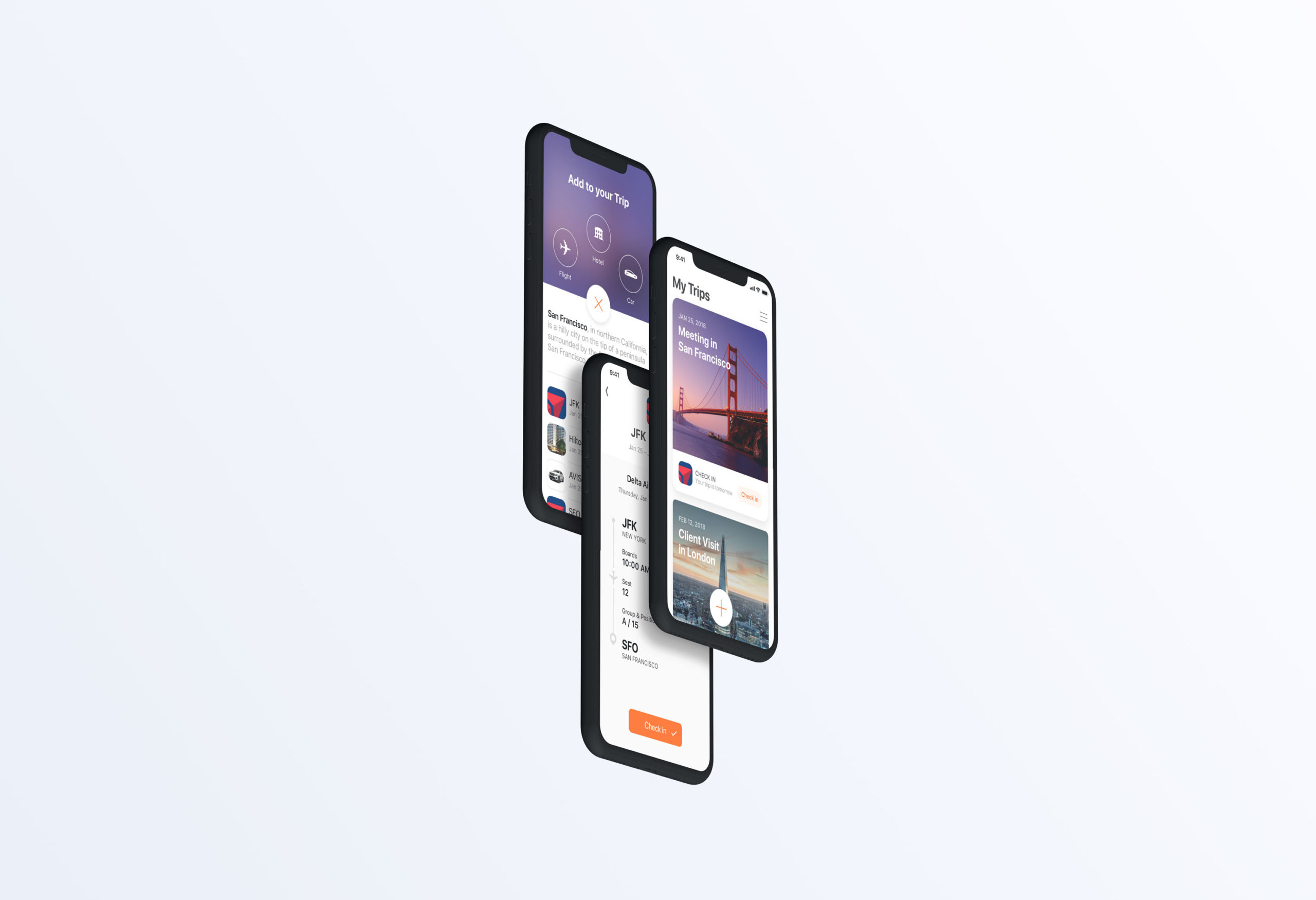
Add to TripProduct Design
Product Interface AnimationsInteraction Design
