INTERACTION DESIGN, ANIMATIONS, 2016-2018
Product Interface Animations – Collection of personal projects
Whenever I have an idea for an animation, transition, or layout, I try to visualize it as a new product or part of a given user experience that I am trying to improve. I immediately think of the user interaction behind every touch or click. The next step is always pen, paper, and chicken scratch drawings, followed by high fidelity mockups and prototyping.
I am sharing some of my favorite UI animations that I posted on my Dribbble a few years back.
These projects were created with Sketch, InVision Studio, and Principle. I made the source files available for download so that anyone can use them in personal and commercial projects. Feel free to create your versions of these designs. Choose the prototypes you like to download below, and I hope you have fun!

Exploring The Space
In 2018, I was part of the group of designers that got early access to the beta version of InVision Studio. I was so excited to give it a try. I got inspired by the dark theme interface and the futuristic spaceship app they introduced in the release video. It was a big hit in the design community, and many of us decided to create versions of the app.
The most critical aspect of InVision Studio as a tool is that I can design, prototype, and create advanced transitions within the same environment – this is very powerful.
I had a lot of fun creating this quick concept of an app that could be a fun and interactive way to teach people scientific facts about our galaxy.

Feel free to play with the InVision open source file
Dribbble Invites
Before I was "drafted" to Dribbble, I remember having to hunt for designers on Twitter who were giving away invites to newbies wanting to join the community. It was not easy to get one back in the day, and if you were already part of the team, you were part of the cool kid's group around the block. Every time I had the opportunity to invite new designers, I would make a little contest on my page and ask them to send me their best work. After that, I would invite those that I like. It was always so much fun!
I had two invites to give away, and the best way I found to say that to everyone was by grouping multi-color circles that formed the shape of the number 2. I animated each of them at different times to move them on and off the frame, creating a smooth easing loop animation. My post attracted great designers' attention, and I reviewed some incredible portfolios of the candidates who wanted me to invite them. I made two of them happy, welcoming them to the community.
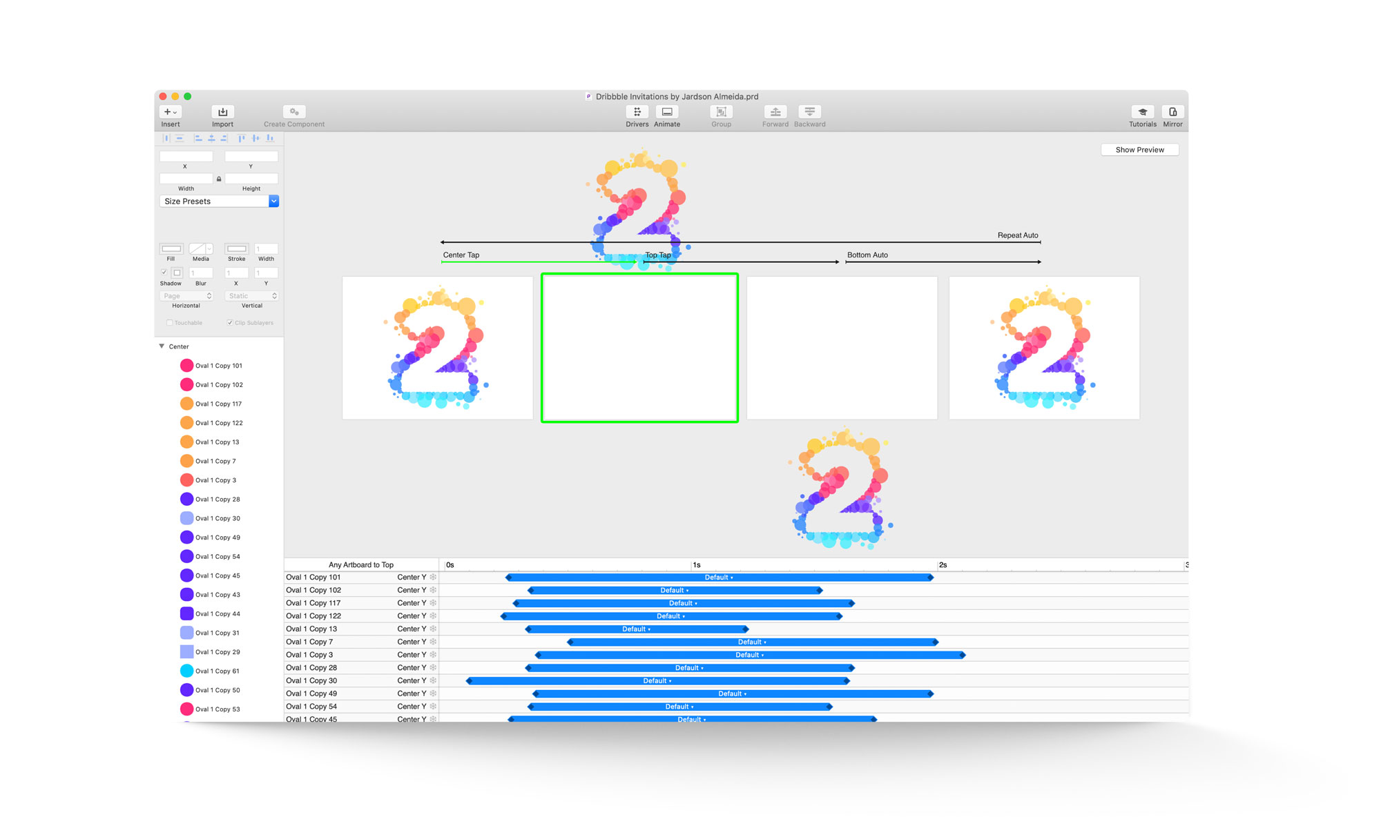
Principle fans, grab the original source file below
Passcode entry animation for TV streaming app
Protecting my data has always been an important matter to me. Today, more than ever, this topic has become increasingly relevant since more and more people want to keep their info, digital content, and social media accounts private and safe.
A few years ago, I saw on Dribbble an animation that Joe Allison, Head of Product Design at Monese, did for their fintech. I reproduced the first part of the animation on Principle and created a similar passcode entry lock screen for my streaming TV (concept) app.
The lock screen animation was just an idea I had of how to delight users with a simple and fun passcode entry animation that could be used at any app or system level.
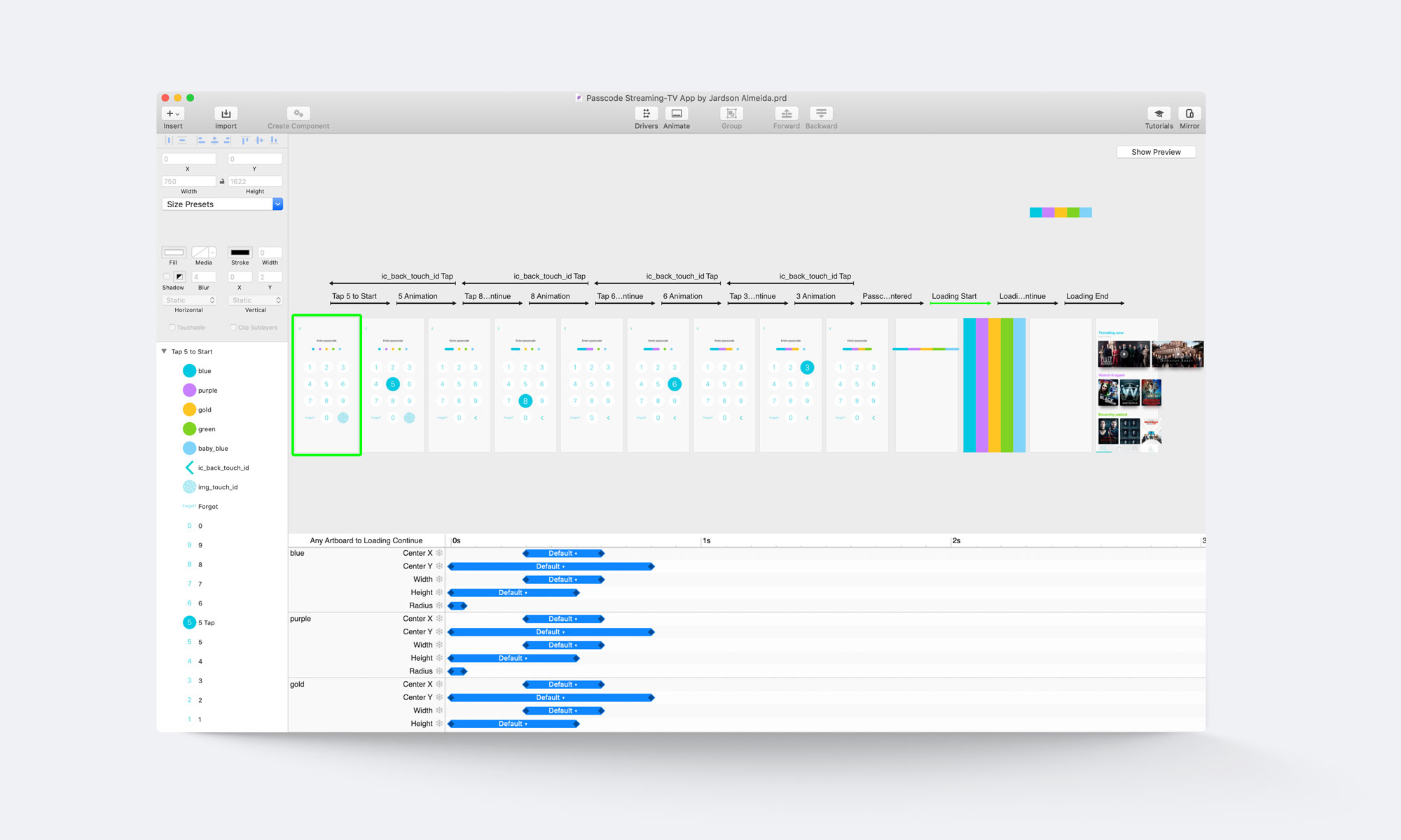
Feel free to download and play with the Sketch + Principle files
B&O Play Concept App
I have a strange love for headphones. I am not a collector by any means, but it's just that I think they are one of my favorite products for a couple of reasons. The main one is my passion for music, which directly connects to the fact that I am constantly wearing headphones blasting my tunes. And also because I find it fascinating how well designed some of these products are. A couple of years ago, I was gifted a pair of B&O Play H8 (by Bang & Olufsen), and I fell in love with how great it felt to wear it while listening to good quality music.
This prototype shows the horizontal swiping transition between products and the "pull down to refresh" behavior. I designed the micro-interaction animation of the FAB button that switches from a grid to a list view as you tap on it.
I also prototyped the vertical scrolling behavior and the selecting transitions between the global list of products and the color selector.

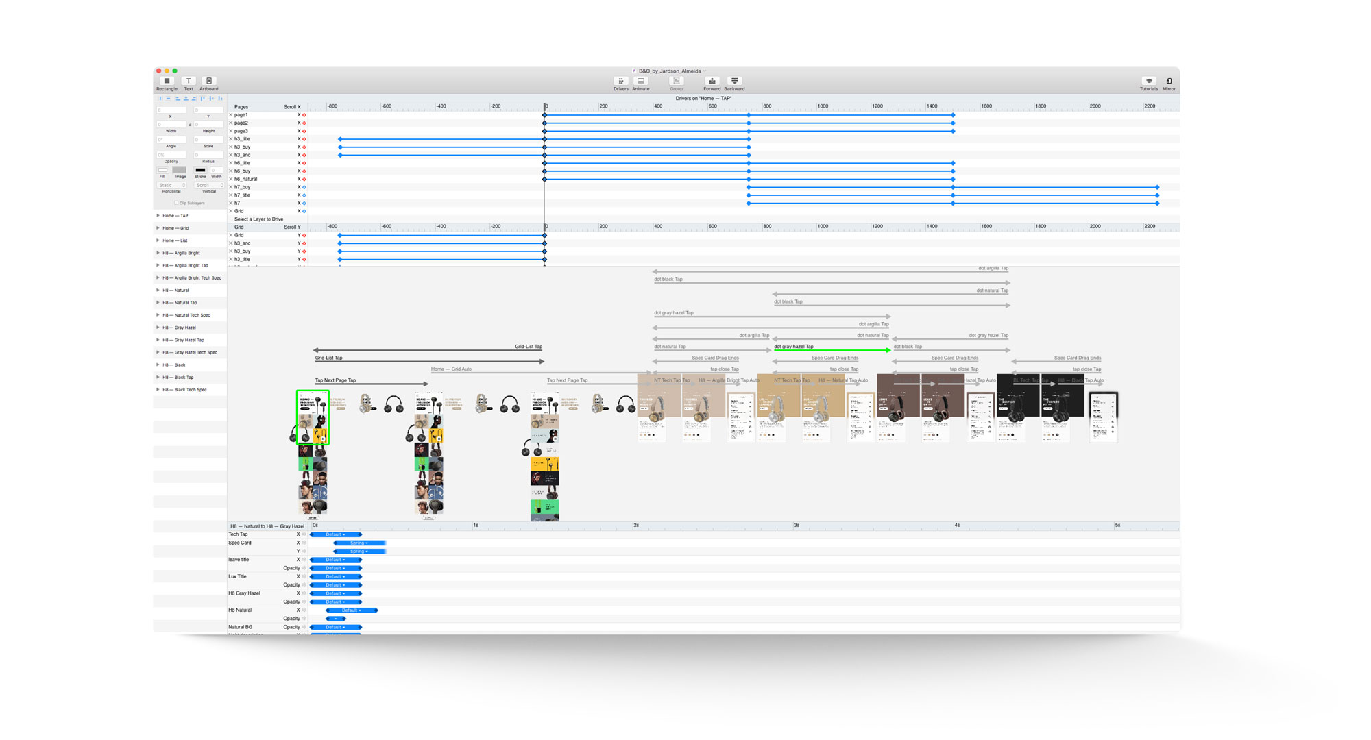
Get the original source files on my Dribbble
All Projects
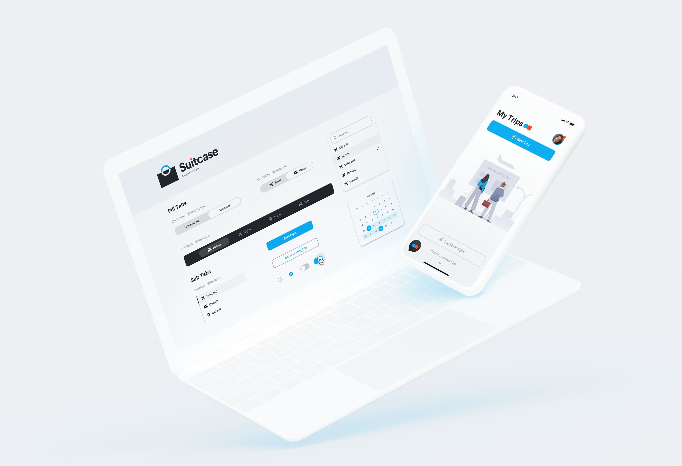
SuitcaseDesign System
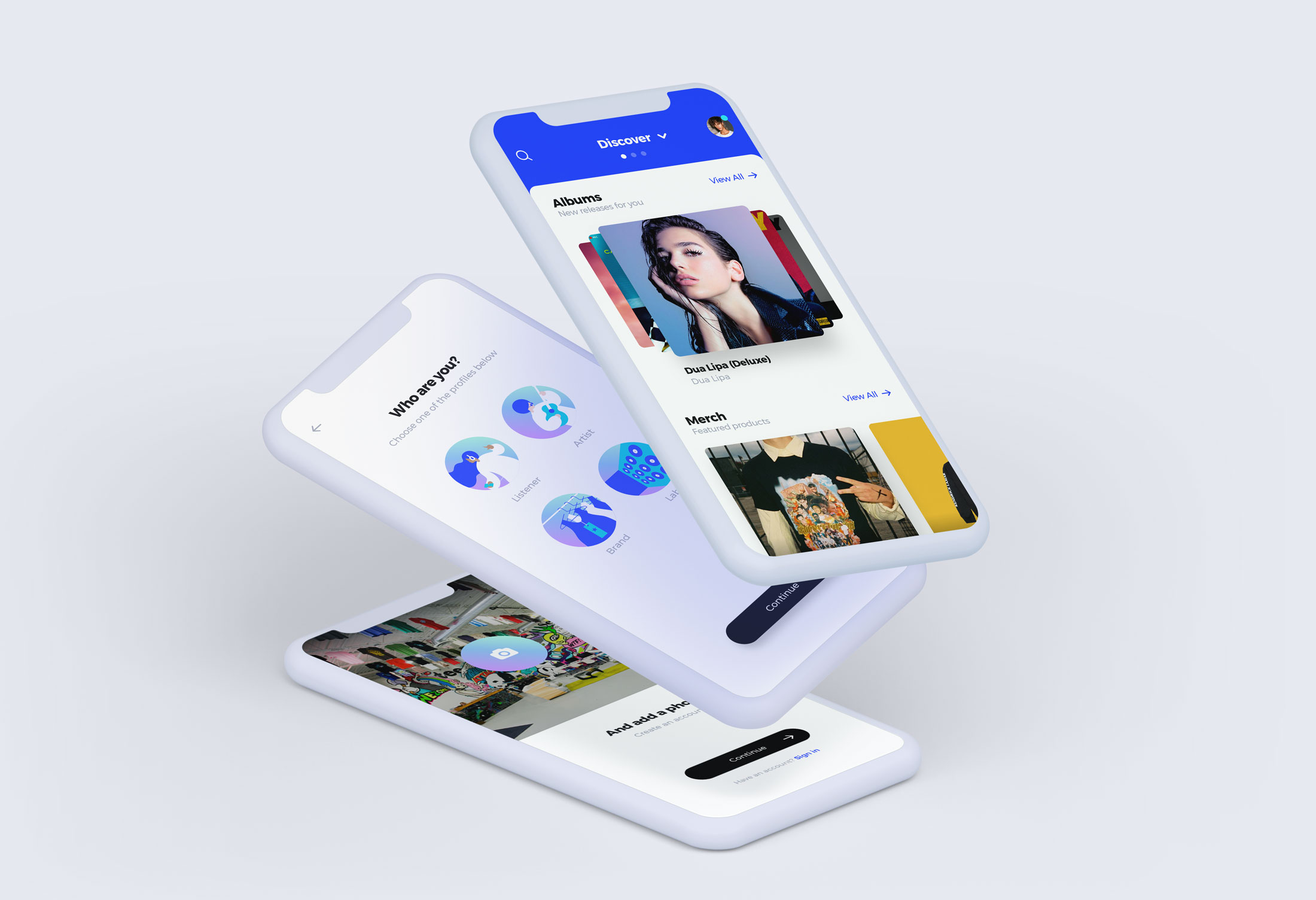
"MusicApp"Product Design
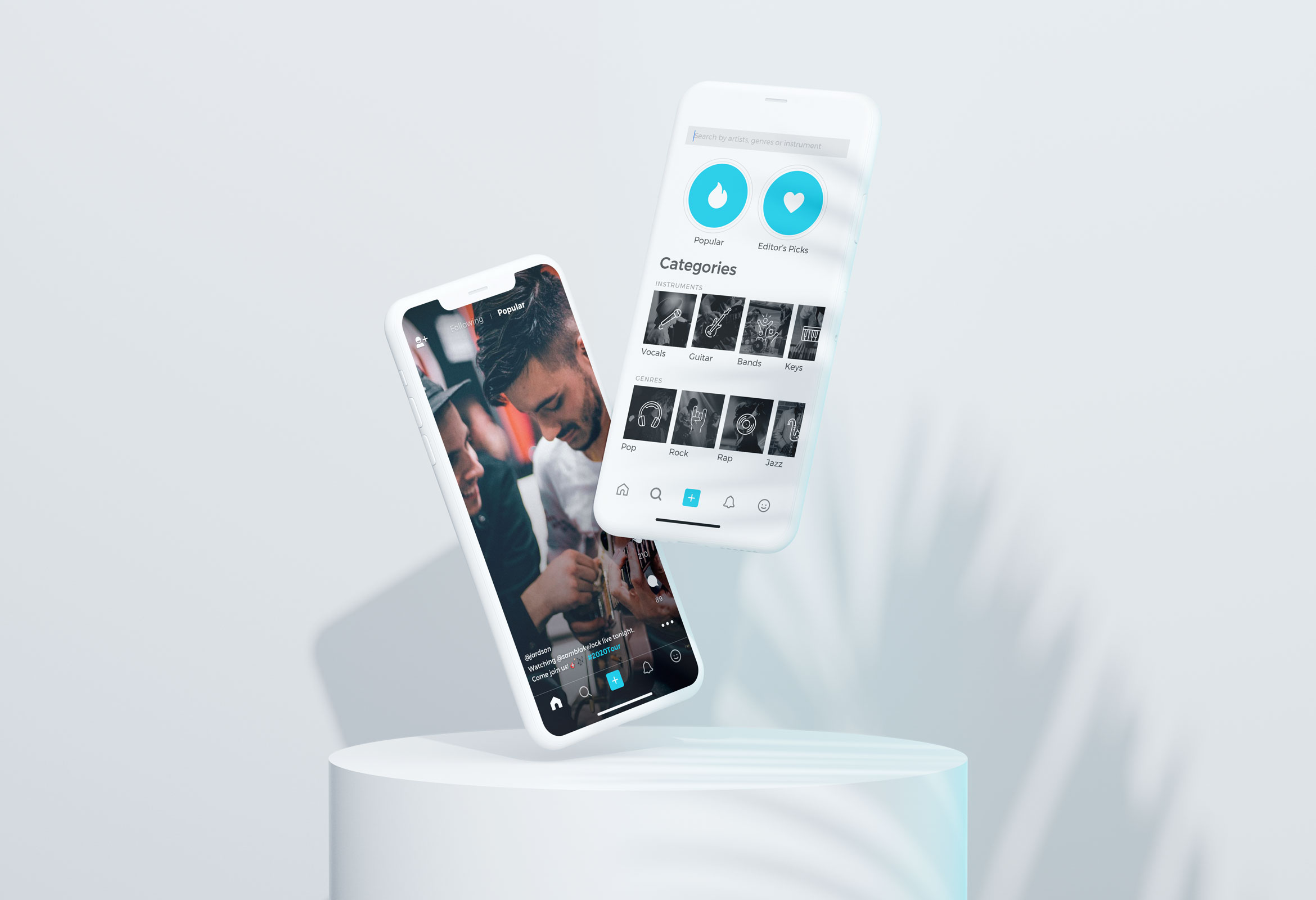
OpenStageProduct Design
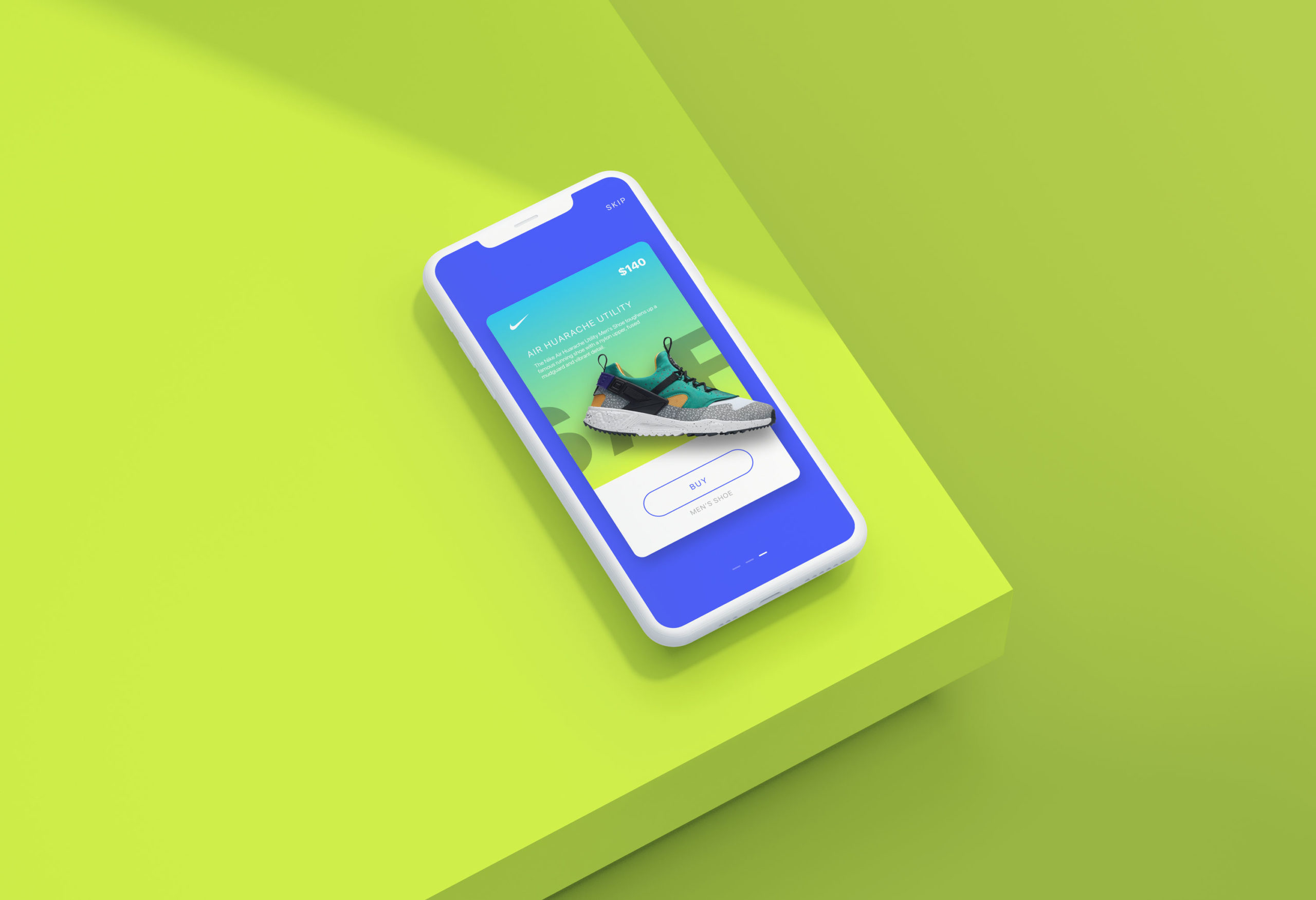
Nike AdsInteraction Design
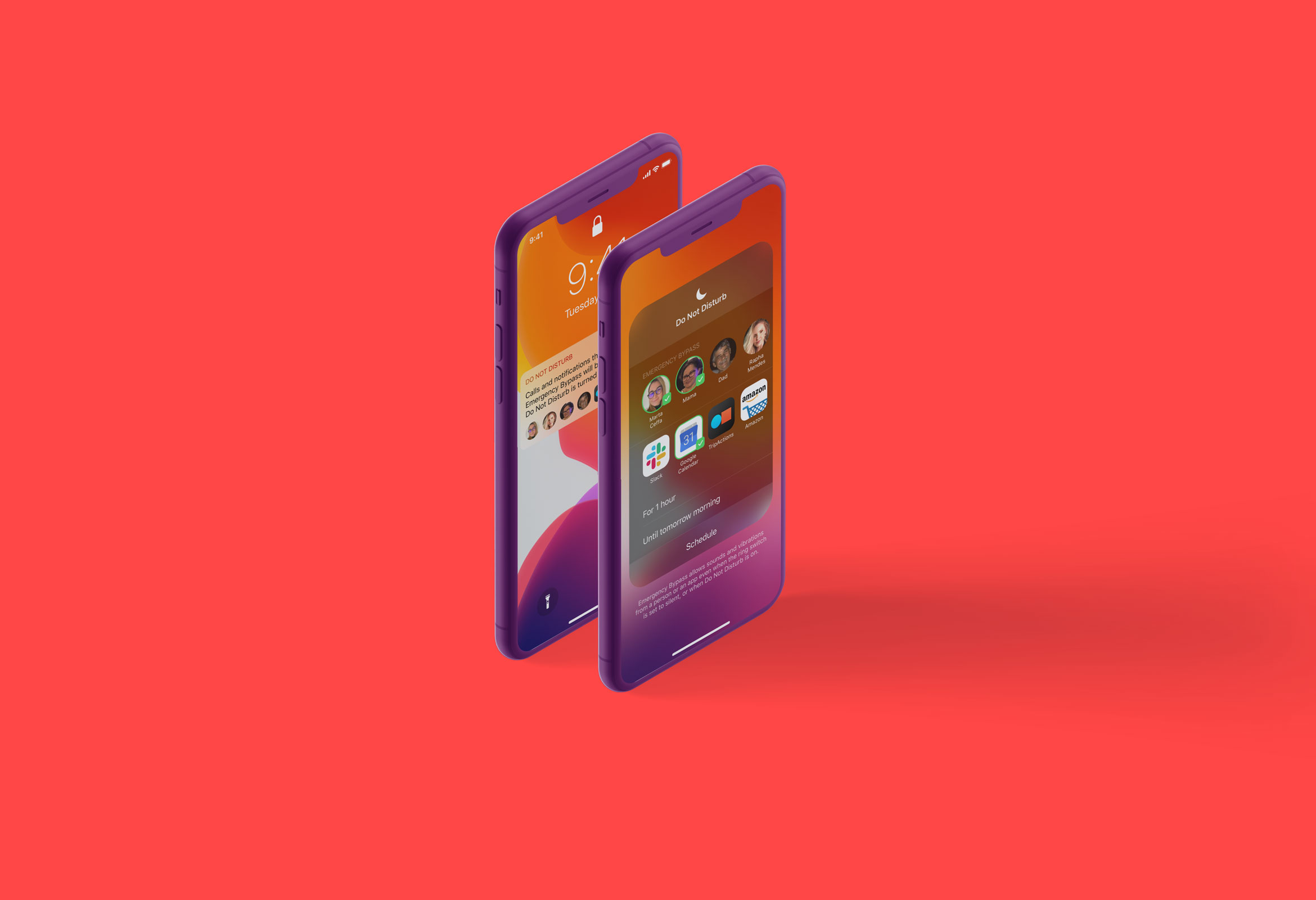
Do Not DisturbProduct Design
Micro InteractionsMicro Interaction
MondrianizmMicro Interaction
Design Social NetworkProduct Design
Pablo LlanquinWeb Design
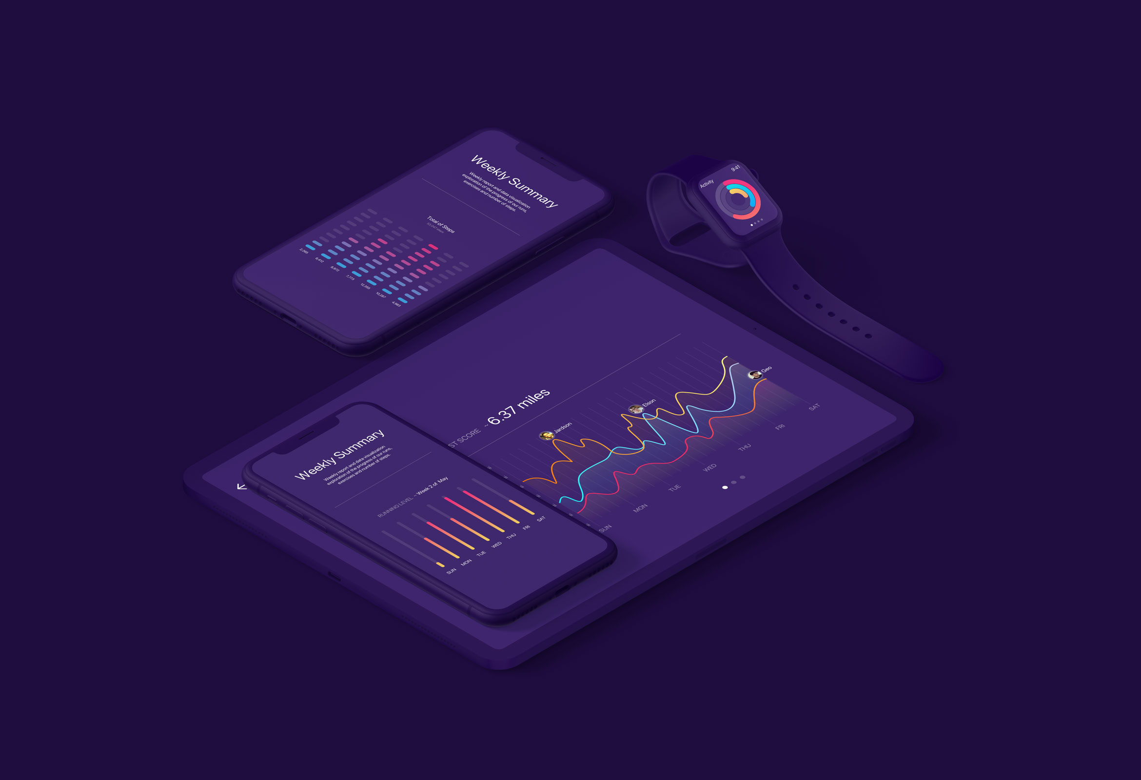
Activity MonitorData Visualization
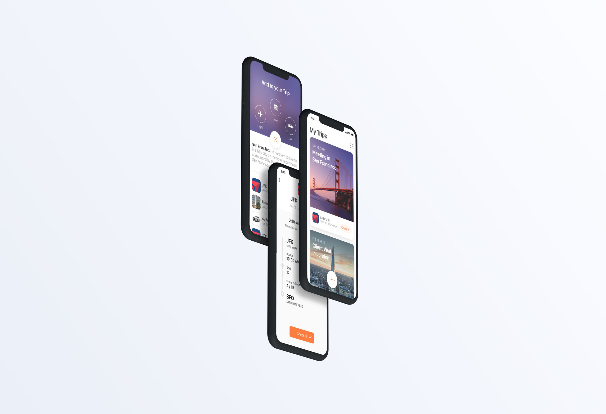
Add to TripProduct Design