ANIMATION, DATA VISUALIZATION, 2016
Activity Monitor – An Experimental Animation of Data Visualization
When I first saw the activity tracker interface Apple introduced with the Apple Watch, I became obsessed with its simplicity. My immediate reaction was to reproduce the ring's animation on Principle as a learning experiment.
Once I was able to mimic the animation of the fitness tracking circles the way I wanted, I also designed bar graphs that represent a weekly summary of runs as well as daily activities, such as Moving, Exercising, and Standing in the same way that I saw on my Watch. Still, in my animated prototypes, I made them responsive to be accessible also on the iPhone and iPad.
In the following prototype, I demonstrate the experience where the interface is responsive (showing how it adapts from one device to another). This way, I can indicate possible solutions to deliver the same information while considering different screen sizes with alternative graphs to represent the data analysis.
Feel free to grab the open-source Principle file
All Projects
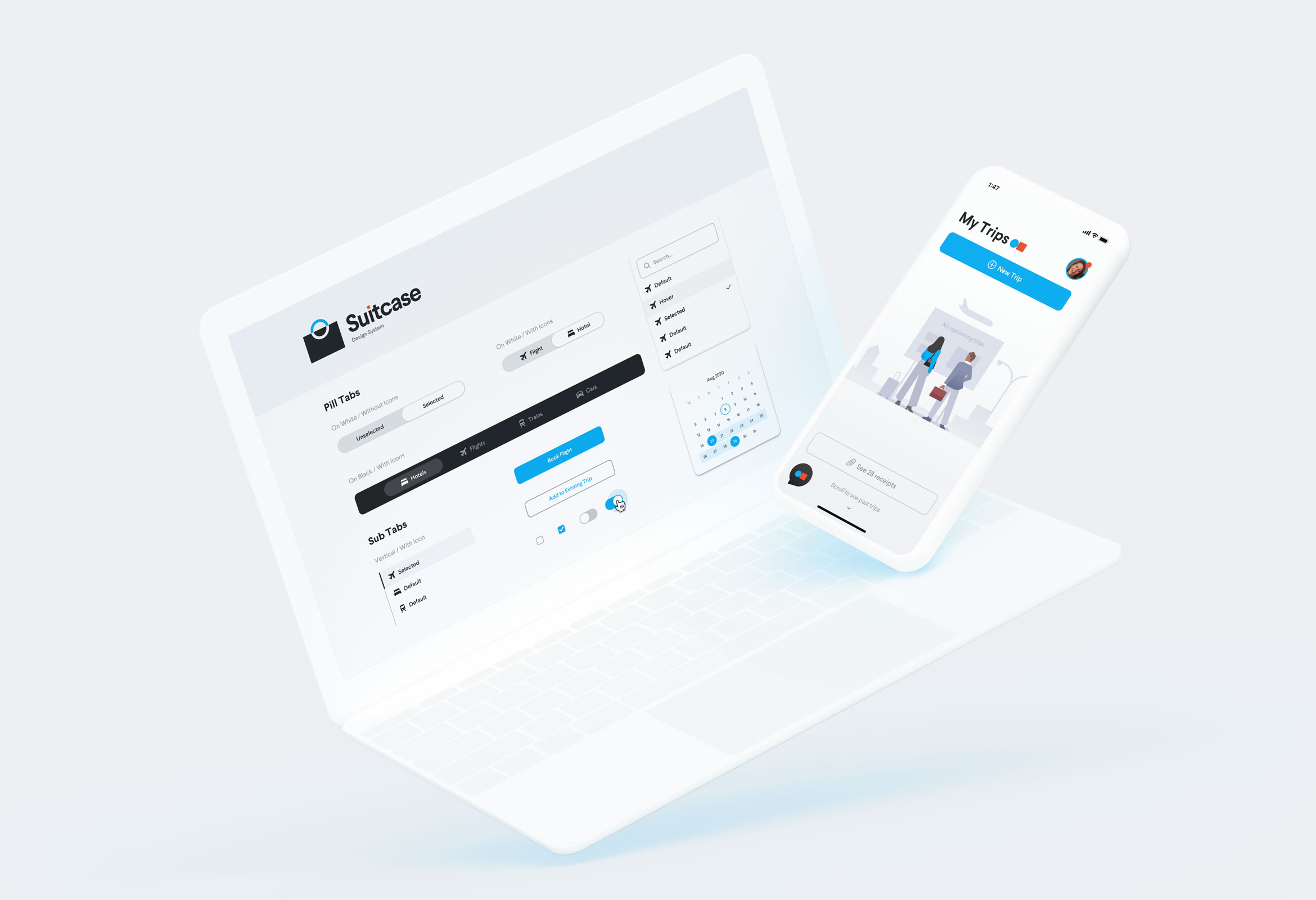
SuitcaseDesign System

"MusicApp"Product Design

OpenStageProduct Design

Nike AdsInteraction Design
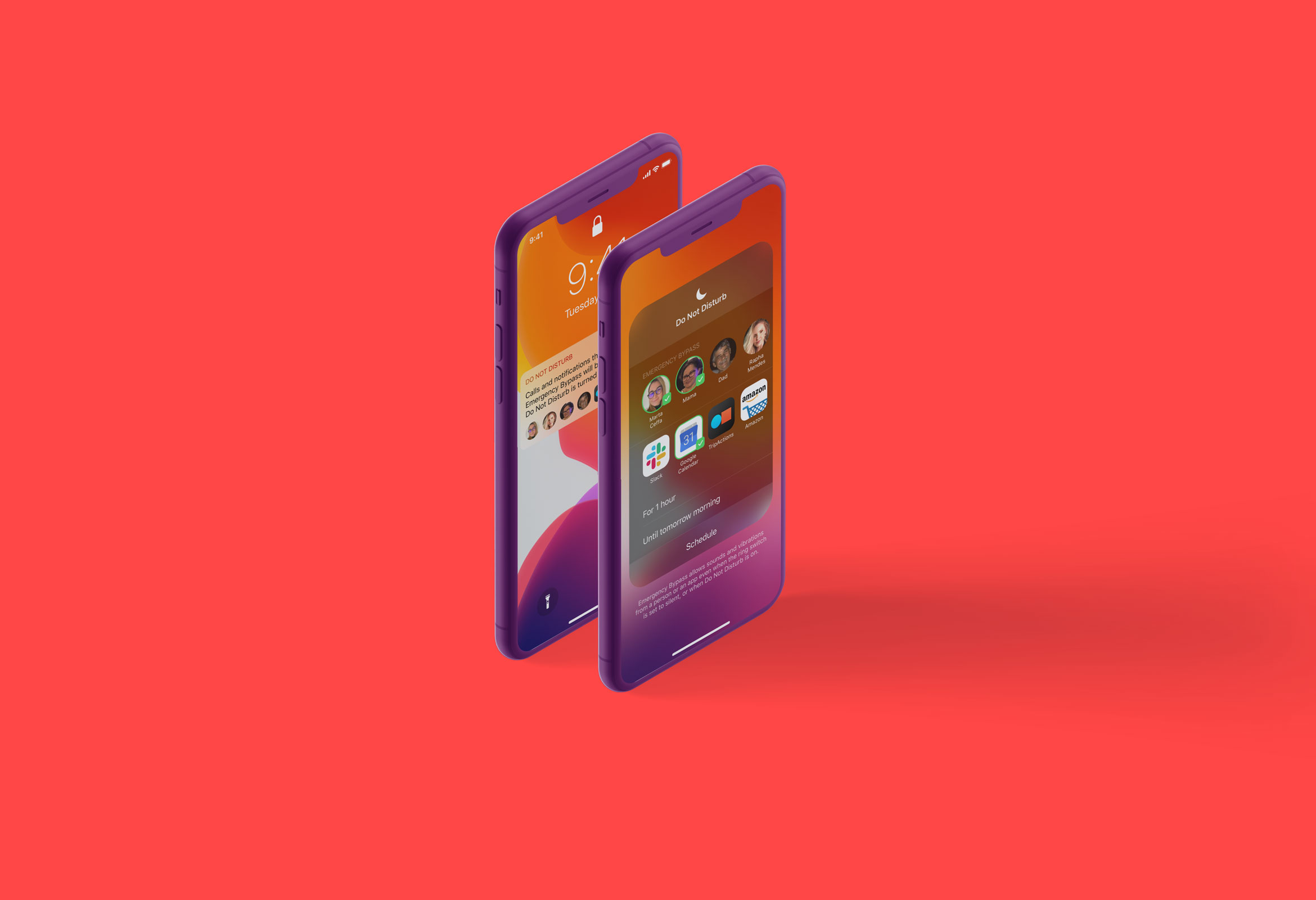
Do Not DisturbProduct Design

Micro InteractionsMicro Interaction

MondrianizmMicro Interaction

Design Social NetworkProduct Design
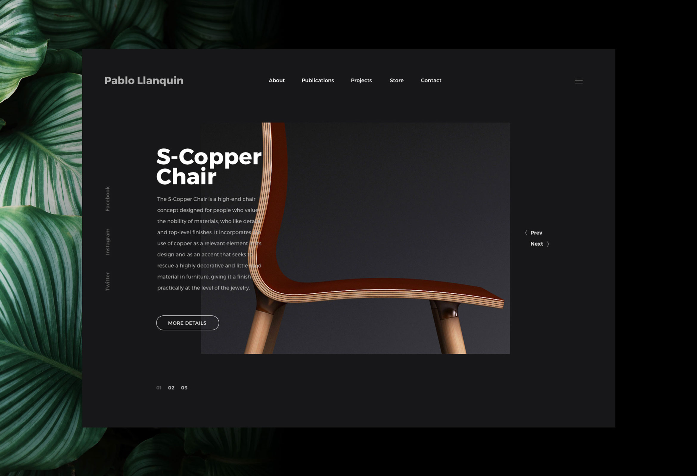
Pablo LlanquinWeb Design
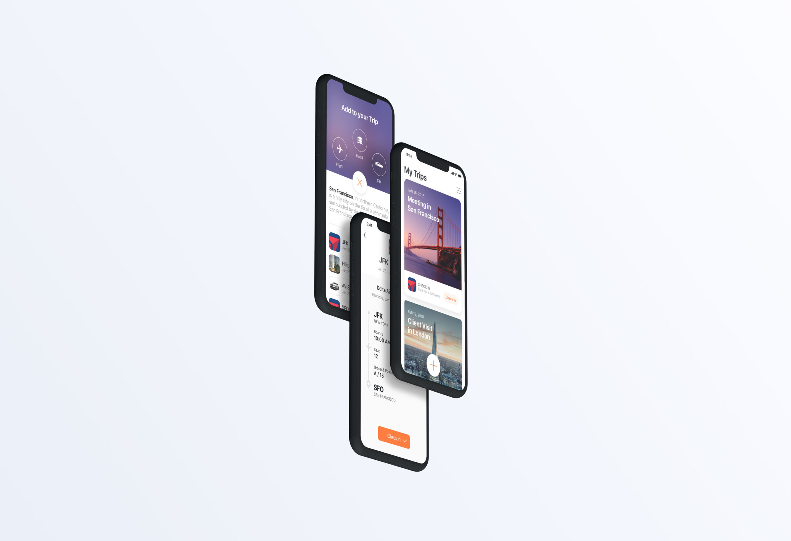
Add to TripProduct Design
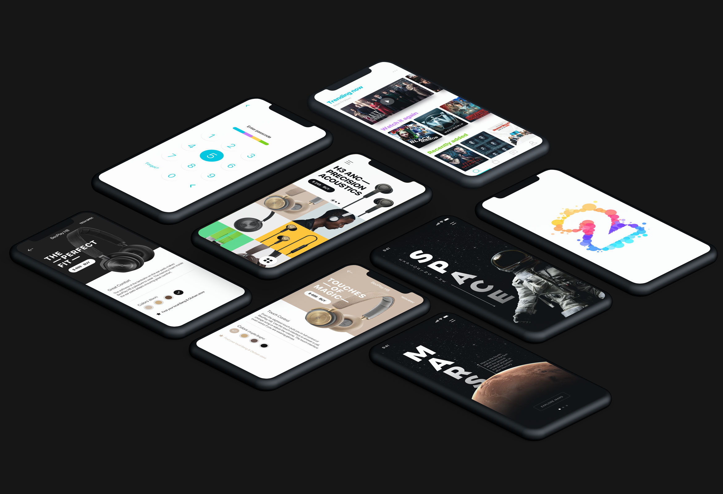
Product Interface AnimationsInteraction Design
